Dividing Tallahassee into Single-Member Districts
Tallahassee, Florida’s capital, home to over 180,000 residents, is currently served by 5 commissioners (four commissioners and one mayor) that are all elected citywide. The city has no districts, with any candidate running city-wide and elected to the seat they file for. There have been discussions about dividing the city into single-member districts, often with the notion of having 5 districts or 4 districts (and a mayor elected citywide). However, for a city the size of Tallahassee, I feel 5 or 4 districts is simply not enough to represent the city. Instead, I created a map that divides Tallahassee into 15 districts. Such a scenario would result in a city-wide elected mayor; who under this proposal would operate more like a Chicago/NYC mayor (negotiations with commission, veto or sign laws, administrative duties). Fifteen districts were chosen for an odd number (to limit tie’s) and to better represent the diverse nature of the city.
–
The Districts
The fifteen districts are shown below.

–
The goal in creating the districts was to combine compactness with a desire to accurately reflect the population of the city. Communities of interest were paired together as much as possible. However, while demographics factored into boundaries, compactness would not be sacrificed. Snake-like districts like those scene in congressional maps are not desirable. The goal of the commission districts is to elect people that represent the area (the unique community) in their district; not to represent a specific demographic group that might be stretched out across the city.
The software used only allowed me to use precinct-polygons to make these maps. In an ideal situation, the districts seen would have a few more changes, with precincts carved up. So while these districts represent where I would draw the lines to a degree, they are imperfect. In some instances moving a district a few blocks further in or out was desired, but not feasible with the software. The changes that would be made are minor, so it is OK to move forward.
–
District 1

District 1 represents the southernmost parts of Tallahassee. It is an overwhelming African-American district that represents neighborhoods like South City and Oak Ridge. It is a working class area and heavily Democratic district. The area is made up of largely older long-time residents further south and FAMU students further to the north. The districts boundaries in the south are like a web to reflect the cities southern border. Campaigning in the southern parts of the district would be very much block by block.
Racial Composition: 84% black, 10% white, 2% hispanic
Partisan Composition: 90% plus Democratic
–
District 2

This unique district is another African-American majority seat that houses the FAMU campus, parts of downtown south-side, and student dwellings further north. This district aimed to be both African-American majority and have a strong student presence. Prominent areas include Providence, All Saints, and FAMU, as well as the downtown business sector. The district is low income and young in age (reflecting the student population).
Racial Composition: 63% black, 24% white, 4% Hispanic
Partisan Composition: 80% plus Democratic
–
District 3

This mammoth of a district is large in land-mass but many of its areas are low population density. The biggest bulk of the population is students in the north (student apartments) and long-time African-American residents further south (but north of Orange Ave). The southern end of the district is simply the airport (no population) and some unorganized residencies. Major neighborhoods and areas include Seminole Manor, Lake Bradford, Mabry Manor, and TCC. The district is plurality African-American, and gets younger and poorer the further north it goes (reflecting the student population). It is very Democratic, and acts as both a minority district and a student-centric district.
Racial Composition: 48% black, 41% white, 8% hispanic
Partisan Composition: 80% Democratic
–
District 4

This district is all about FSU. The district includes the main campus and its housing/apartments/and other living arrangements around it. The Chapel Ridge student living zone is to the west of stadium drive, while Frat and Sorority homes dot the Jefferson street area. The area south of Pensacola St is largely student-rented homes as well as some full-time residents. If I could break precincts I would have moved the district a few more blocks east to grab the last student Frats and Sororities. The district is low income students and safe Democratic. Its also the youngest district, with an estimated 90% of the population under the age of 24.
Racial Composition: 73% white, 10% black, 11% Hispanic
Democratic Composition: 65% plus Democratic
–
District 5

This district is a suburban middle class precinct on the central east side of Tallahassee. The district stretches from Governor’s Square Mall to Lafayette Park; packing in similar middle class suburbs along the way. The district is middle class suburban, with average income ranging from 30 to 60 thousand dollars a year. The district is largely middle-aged adults/parents raising families. Prominent neighborhoods include Lafayette Park, Old Town, and a southern portion of Betton Hills. The district is populated by white collar, well-educated workers, with the percent of Bachelor Degrees ranging from 50% to 65%. The district is suburban in nature but also largely Democratic-aligned.
Racial Composition: 77% white, 14% black, 5% hispanic
Partisan Composition: 60% Democratic
–
District 6

This suburban district to the south of district 5 combines famous Indianhead Acres and Meyers Park together with other assorted suburbs further east. Indianhead, with its reputation for high political activism, sits at the center of this district, and its likely a commissioner would come out of that area (or with its support). The district is similar to 5, with middle-class, white-collar families. Income and education level are similar to district 5; although this district is even more Democratic. Indianhead has the reputation of the middle class white suburb that ALWAYS votes Democratic and its nature helps shape the rest of the district. A strong African-American presence in the district also makes it a minority-access seat and even more solid in the blue column in elections.
Racial Composition: 56% white, 34% black, 5% hispanic
Partisan Composition: 70% plus Democratic
–
District 7

District 7 is a combination of the south/central eastern Tallahassee. It could easily be dubbed “the outsider” because it combines areas of Tallahassee that because of their location, are at times very much separated from the rest of Tallahassee. Ignore the big rectangle at the bottom, it is an un-populated precinct. Right about it is Southwood, an upper-class community that built less than two-decades ago. Further up, to the east of Tom Brown Park, is Piney-Z, a suburban community with its own local elected officials, and to the far east is the Buck Lake Neighborhoods, which are the most isolated from the rest of the town. All three of these major areas are connected with Tallahassee, but in many ways separated from it due to their location and the self-sustaining nature. This district is also very well off economically, with Southwood and the Buck Lake families making over $100,000 a year. The area is largely white upper-class, but still as a Democratic tilt. Southwood is a swing precinct that never goes hard right, but generally leans Republican while Buck Lake votes a little more Democratic and Piny Z and the other scattered residencies are much bluer. The district could easily elect a Republican, but a strong local Democrat especially out of Southwood (Gil Ziffer for example) could win.
Racial Composition: 61% white, 20% black, 8% hispanic, 9% asian (making it the highest asian % district in the city)
Partisan Composition: 55% plus Democratic
–
District 8

District 8 covers most of the eastern/central edge of Tallahassee above Buck Lake but under Killearn. The district goes up Capital Circle E, including neighborhoods Mellody Hills, Centre Point Village, and Meadowbrook. The district encompasses alot of loosely organized residential areas in many business districts that populated the Capital Circle area. In general the district is fairly well educated and modest middle class (average income around $50,000). It is a fairly loosely arranged district, taking in areas that have no specific ties elsewhere.
Racial Composition: 64%, black 24%, Hispanic 5%
Partisan Composition: 60% Democratic
–
District 9

Move back to the campus area and we get to district 9. This district covers student dwellings right on the north side of the FSU campus, while taking in African-American Frenchtown. The western part of the district includes Frenchtown and Levy Park, both populated by low-income long-time residents The eastern side is more student-dominated, where the youth % dramatically increases. Both groups of long-time African-American residents and young FSU students make the district overwhelmingly Democratic and an African-American majority district.
Racial Composition: 55% black, 35% white, 6% hispanic
Partisan Composition: 85% Democratic
–
District 10

Move back to the east and we get to district 10, to the north of district 8. District 10 is a collection of several subruban communities along Thomasville/Centerville/and Meridian Road. Prominent communities include Waverly Hills, Woodgate, Betton Hills/Betton Woods, and Eastgate. These communities are very similar in alot of ways; all boasting high education (over 60% bachelors degrees) and average income ranging from $80,000 to $100,000. These suburbs are lean Democratic but easily break away to local Republicans or state-wide ones in redder years. The district is ideal for a Republican like Steve Stewart (2010 Mayoral Candidate) who lives in Waverly.
Racial Composition: 77% white, 14% black, 5% hispanic
Partisan Composition: 53% Democratic
–
District 11

District 11 is the most northern of the districts. It exists entirely above I-10 and takes in southern portions of Killearn Estates to the east, then goes up to the north/west to take in Ox Bottom Manor and Summerbrook. Those two communities to the north are very Republican and high-income, while the area connecting them and the southern portion of Killearn are very low population. The southern Killearn area in this district is actually nominally Democratic (compared to the rest of Killearn), but it is overridden by Ox Bottom and Summerbrook. Summerbrook and Ox Bottom will likely dominate elections for this district. Overall the district is largely white, upper-income (as high as $130,000) and Republican; one of only two district to have voted for McCain or Romney.
Racial Composition: 75% white, 13% black, 3% hispanic, 5% asian
Partisan Composition: 52% Republican
–
District 12

Heading back to the campus area of town, this district lies north of district 3 and west of district 9. The entire district is confined between Tennessee Street (south) and Tharpe Street (North). The area is largely student oriented, with some residentual suburbs off White Avenue in the San Luis neighborhood. Otherwise the district largely encompasses student dwellings that dot the area. The further west the district extends the less student-heavy it gets. The district is 33% African-American and serves as both a student and African-American opportunity district.
Racial Composition: 52% white, 33% black, 10% hispanic
Partisan Composition: 75% Democratic
–
District 13

District 13 is a unique amalgamation of student-populated housing in its south and long-time residencies in the north. Overall the entire district is suburban, home-dominated in nature; but students are known to rent out houses north of Tharpe street. Their is a clear income and an age divide between the north and south 0f the district, which will create a unique dynamic when elections come around. Due to low-turnout among students for local races; the north may very well determine the commissioner for the district. The districts 36% African-American population also makes it a strong minority-access seat.
Racial Composition: 53% white, 36% black, 7% hispanic.
Partisan Composition: 65% Democratic
–
District 14

To the west of district 13 lies district 14. This district is composed of a several business districts and suburban communities in the upper-midtown of Tallahassee. On the west side of Monroe street lies Forrest Heights, which combines student renters and suburban residents. In addition, the area includes neighborhoods like Town and County and Parkside. On the east side of Monroe Street is assorted residencies like Macon Community and the business district around Tallahassee Mall. The district is modest middle class, with an income around $40,000 a year; with the population split between white collar workers and blue-collar working class.
Racial Composition: 60% white, 28% black, 7% hispanic
Partisan Composition: 65% Democratic
–
District 15

The last of our districts is the the second and last to actually vote Republican in the Presidential election. This district encompasses the majority of Killearn Estates, Foxcroft, and Royal Oaks. The vast majority of the districts population lies in the Killearn area on the western half of the district with the eastern half largely being scarcely populated land. The district is made up off well-educated (average 60% bachelors degree) white collar workers or business owners. Income in the district ranges from $80,000 to $120,000 a year. The district is sure to be a golden opportunity for a Republican politician.
Racial Composition: 84% white, 7% black, 4% hispanic
Partisan Composition: 56% Republican
–
Overview
This fifteen-district map aimed to balance compactness and neighborhood similarities with a desire to also balance racial considerations. With the African-American population around 35% of the population, the ideal scenario is 1/3 of the districts would be African-American. However, the desire for compactness and keeping similar communities together made such a scenario impossible. The resulting map creating 3 majority African-America Voting-Age-Population districts, and an African-American plurality district (which is in fact majority African-America if not just counting voting-age-population); totaling four districts. In addition, there are three minority-access districts; districts where the African-American voting-age-population is above 30%. These three districts combined with the four others result in 7 of the 15 districts having a significant African-American influence.
The map below shows the demographics of the districts: red represents majority-white, blue represents majority-black, light-blue represents plurality-black, and light-red represents minority-access.

–
In addition the political representation of the map also conveys the Democratic nature of Tallahassee. A city that only gave Republican Presidential candidates between 33% and 31% of the vote only has two districts that cast ballots for a Republican Presidential candidate. The map below shows the averages between the 2008 and 2012 races. Dark blue is Obama over 60%, light blue is Obama over 50% but less than 60% and red is Republican win.

–
Overall, this district map does its best to represent Tallahassee while balancing a whole host of different concerns and needs to create an effective map. Whether Tallahassee ever implements such a system remains to be seen, but any such map should work to balance communities, demographics and compactness. I believe this map does its best to balance that.
Massachusetts Senate Special Election Round Two: Scott Brown Strikes Back
Anyone following the political news these days has no doubt heard the reports that Senator John Kerry of Massachusetts will be appointed the next Secretary of State once Hillary Clinton steps down. With Kerry at the helm of the Foreign Relations Committee, and a well-respected voice on manners of diplomacy, Kerry is a strong choice and easy shoe-in for confirmation (don’t be surprised by a 100-0 vote). For Kerry, a stint as Secretary of State for the remainder of Obama’s Presidency would be a nice feather in the cap of his career, and complete redemption for his tough loss to George W. Bush in 2004. Kerry clearly wants the position, is qualified, is respected by Republicans and popular with Democrats, and overall this is a great thing…
…mostly.
–
Massachusetts Values (and laws)
Normally, such a move for Kerry would be cause for quick celebration for Massachusetts Democrats. While this means losing their senior senator, their Governor, Deval Patrick, is a Democrat who would for sure pick a Democratic replacement. In most states, Governor’s have full discretion over their choices (regardless of party) for replacements in these vacancies. However, the law in Massachusetts is fundamentally different. Back in July of 2004, the Democratic Super-Majority legislature of the state passed a law that would bar the governor from making appointments in case of a vacancy. Democrats feared that if Kerry, the Democratic nominee for President at the time, won the 2004 Presidential Election, then Governor Mitt Romney would appoint a Republican replacement. While a simple solution would have been to change the law like other states have done to require the appointment come from somebody in the same party as the Senator leaving the post, the legislature instead aimed to require a special election for all Senate vacancies. The bill was vetoed by Romney but overridden by the legislature. Several years later, when Senator Ted Kennedy’s health was fading after his battles with cancer, a move was made to change the law (after his passing) to allow for an interim appointment between the vacancy and the special election that would take place in between 145 and 160 days from that time. The new law now allows for an interim appointment, but still a special election is needed. This of course led to the infamous 2010 Special Election where Republican Scott Brown won the seat of Ted Kennedy. The race was notable in being the first time a Republican was elected to the US Senate from Massachusetts since the 1970s.
Scott Brown would go on to lose in a general election match in 2012 against Elizabeth Warren at a time when Barack Obama was on the top of the ballot.
However, with the likelihood of a Kerry appointment, Scott Brown already has a chance at a comeback. Brown is conceivably the only Republican with a strong chance of winning the US Senate Seat, and has ample reason to try for the seat and continue a Senate career. Brown posts high approvals in the state (his biggest problem in 2012 was that Warren also had good approvals and control of the US Senate was a factor in how the Democratically-aligned electorate cast their ballots) and does not need to worry about Barack Obama being at the top of the ballot. However, Brown must also know that a win in the special means another race in the 2014 General for a full term and a Republican label will always been a drag on his chances, especially for federal office. While Brown could mull to lay low and aim for the open Gubernatorial Election in 2014, its a strong likelihood he makes another play for Senate.
Democrats have many candidates, some higher-level than others. Most of the congressional delegation is no doubt considering a run, as well as Ted Kennedy’s widow, Vickie; other members of the Kennedy family, and Governor Deval Patrick. Without a clear Democratic front-runner the focus for now will lie on the state of politics in Massachusetts and the strengths and weaknesses of Scott Brown. In doing so, we can see where Brown is strongest in the state and weakest; as well as what drives the votes toward Brown unlike other Republicans before.
–
Politics of Massachusetts
Massachusetts is known to be one of the most Democratic and liberal states in the country. While it still has elected Republicans to state offices (much like how Wyoming had a Democratic Governor from 2002 to 2008), at the federal level Democrats dominate. No Republican had been elected to the US Senate from the state sense the 1970s, and the congressional delegation has been completely Democratic since 1996.
Looking at the political fluctuation of Massachusetts can be difficult on the county level. There are only 14 counties in the state, which can make it hard to analyze in a meaningful way. However, the state is also divided into 351 towns or cities. There is no unincorporated land in Massachusetts; everything falls into a town or city. These towns and cities will be how we judge the partisan nature of the state.
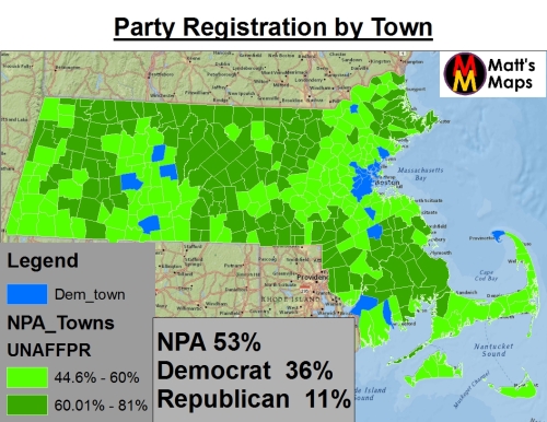
First, lets look at a very crucial detail about Massachusetts. While the state is indeed very Democratically-aligned, and very liberal, its party registration tells an entirely different story. In fact, Massachusetts boasts the largest percentage of independent voters than any other state.
 –
–
Independents are over half the state, and dominate most of the towns and cities, while Democrats, the second largest group, hold in Boston/Cambridge and other scattered cities. Republicans, all the way down at 11%, don’t dominate in any region. While the independents dominate, they clearly have a Democratic lean in most races, and even without, Democrats are still well positioned overall. If Democrats were able to keep 100% of their members in line with a candidate, they would only need 25% of independent voters to back them to still win. For a Republican to win, they need to not only win independents by a large margin, they also need to win a good amount of Democrats.
- For example, when Brown lost to Warren in 2012, he still won Independents with 59%, and won 11% of Democrats. With all that, he still lost by 7%. In his 2010 win, Brown won 64% of independents and 20% of Democrats to get his 2010 win.
Of course, looking at this map its important to remember that the population is hardly spready out evenly across the state. As would be expected, a large chunk of the population is in the Boston area. The symbol map below shows the population of each city, with larger circles representing bigger populations.

–
Population is largely clustered in the Boston region and its surrounding areas on the coast, with suburban towns and smaller urban centers standing out across the map.
–
Partisan Leanings in Massachusetts
To asses the partisan politics of Massachusetts, its important to look specifically at the more competitive and high-profile races than the typical blow-outs for Democrats. Senators Kennedy and Kerry always won overwhelmingly, and many cabinet level Democrats rarely faced strong opposition. In these non-competitive races, Democrats can come close to winning every single town or city in races with weak Republican opposition. An example is Ted Kennedy’s last Senate win from 2006.

–
Kennedy, in taking 70% of the vote, won all but 3 of the 351 cities and towns. However, while this shows the apex of Democratic strength, it is highly unlikely to be the case in the special election when Scott Brown is running.
–
Examined Races
For an analysis of competitive races, there were a few key choices for selection over the past 10 years. The races chosen represent close-calls, semi-competitive elections, and Republican wins.
- 2010 Senate Special Election — This is of course the top of the list, as it was single-handily the most shocking election results in the state’s history. Scott Brown beat Democratic Attorney General Martha Coakley in an election that should have been a walk for the Democrats.
- 2012 Senate General Election — This race showed the limits to Scott Brown’s appeal. Brown was challenge by Elizabeth Warren, a Harvard Professor and adviser to President Obama, who proved to be a powerful campaigner and fundraiser. With President Obama on the top of the ballot and a majority of the state desiring a Democratic Senate, Warren won by 7%.
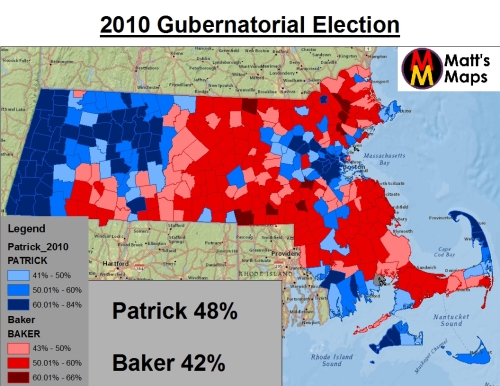
- 2010 Gubernatorial Election — Nine months after the special election shocker, first-term Democratic Governor Deval Patrick was looking for re-election. Patrick had a rough first year, and while his approvals has bottomed, they were rebounding slowly as the election drew. Patrick was at risk to a Republican moderate challenger (Baker) and a challenge from conservative Democratic-turned Independent Tim Cahill (the state Treasurer). Patrick won re-election by 6%.
- 2002 Gubernatorial Election — The second Republican win, when Mitt Romney won the governor’s race in a close race. Romney benefited from a Democrat weakened by the primary campaign.
- 2006 Gubernatorial Election — In 2006 Romney was not popular and risked losing re-election. With plans to run for President in 2008, Romney opted not to run and left the party trying to hold the seat in a year that was looking to be very favorable to the Democratic Party. Deval Patrick, after winning a crowded primary, went on to win the race by 20% (with 55%, and 10% going to assorted independents), in a race that could have been competitive but slipped away from Republicans in the blue year.
The following races can be seen in the maps below. Pay attention the the color shadings (which are uniform for each map). Notice how much more dark red exists in Scott Brown’s win (representing larger wins). 


–
Looking at the first three maps show a pattern of Republican support in key sections of the eastern half of the state. The key to Brown’s victory was to really rack up the vote in those areas; while Romney’s win came from a more scattered win across the state (granted that race was 10 years ago and regional strengths have since shifted).
Based off these results its possible to create a party loyalty map based on the results. I broke down each town into a category based off its results in the competitive races.
- Strong Democrat — Democratic wins in all five races
- Likely Democrat — Democratic wins except in 2002 or 2010 Special Senate Election
- Likely Republican — Republican win except 2006 Governor
- Strong Republican — Republican win in all of the five races
- Swing — Variation wins depending on the race

–
Compare this map with the registration density map, and you see that overall Democratic towns hold much more population than Republican areas. For someone like Brown to win, he had to win the Likely Democratic towns. Democratic areas hold 2,239,652 voters, while Republican areas only hold 1,207,651 registered voters. The swing region isn’t enough to close the gap (just over 866,000 voters), so any Republican win involves eating into the Democratic areas.
The situation is difficult for Republicans to navigate. Looking at Scott Brown’s 2010 win will give a better look at a Republican path to victory.
–
Scott Brown
In the winter of 2009 Scott Brown was just a state senator in Massachusetts. With a reputation as a moderate, he was the best choice for Republicans who is largely believed they had no chance of winning the US Senate seat. Brown won in a major upset, and instantly became a household name. Brown now finds himself a popular figure in the state despite losing re-election. He was defeated while holding a 60% approval, to a 32% disapproval. His loss was thanks to Warren’s popularity and the state’s wish for Democrats to control the Senate. Brown’s image is now that of a moderate, acceptable statewide Republican (deserved or not is not the issue). This makes Brown a strong candidate for the election.
Brown’s 2010 win should be looked at even closer. First, lets look at the actual percentage breakdown by each town.

–
Brown dominated in middle and eastern Massachusetts (minus the urban areas around Boston), winning over 60% of the vote in many areas.
Compare this with the percentage map for Charlie Baker, the 2010 Republican Gubernatorial nominee would lost by 6 points to Deval Patrick (but this makes him the most successful Republican candidate except for Romney, which was 10 years ago). Baker and Brown won similar areas, but as the map below shows, Baker’s percentages were smaller than Brown’s.

–
Baker won many of the same towns as Brown, but one them more with 50%+ rather than 60%+. Brown’s winning wasn’t just winning so many areas, but the sheer margins he racked up where he did win.
Lets look at this further. Lets look at how much better Brown did in 2010 than the Republican nominee for Governor did in 2006 against Deval Patrick. The map below shows the percentage improvement Brown had compared to the 2006 election for Governor. Higher percentages mean more of the vote Brown got compared Democrat Deval Patrick.

–
In several areas Brown gained over 25% of the vote compared to his Republican counterpart from 2006. Brown’s increases coincide with the big wins he had in the middle and southeast of the state.
Look back to the party loyalty map, and lets see how Brown did with the towns/cities that fell under likley Democrat and swing. Did Brown win most of the swing towns? Did he rack up alot of the likely Democratic areas? The map below shows yes.

–
Brown overwhelmingly won the swing towns (dark red), taking almost all of them. Meanwhile he also won several likely Democratic towns (light red). He had strong appeal with the swing region and a good amount of crossover appeal in 2010.
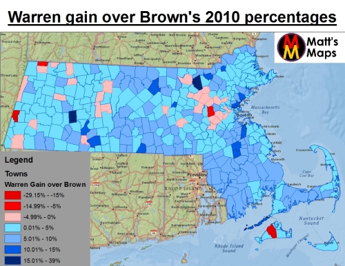
However, Brown was not able to use his crossover appeal and good approvals to ensure re-election in 2014. Warren beat Brown by 7%, thanks to her taking back ground that Brown had gained in 2010 for the Republicans. The map below shows the losses in vote Brown suffered between 2010 and 2012. Positive numbers are losses for Brown, and negative numbers are actually Brown performing better (the numbers were achieved by subtracting Brown’s 2012 percentages from his 2010 percentages).
–
As seen, Brown lost ground almost everywhere except a few scattered areas. Warren made decent gains compared to Coakley in the southeast and middle Massachusetts, blunting some of Brown’s margins (even though he still one many of those areas).
Looking at Brown’s 2012 loss on the party loyalty scale, we see Brown still did well in the swing towns, winning almost the same amount, but the key difference being he didn’t win a single likely democratic town.

–
Brown still did well in the swing areas (as demonstrated by him winning independents in the exit polls). However, in Massachusetts its not enough to take the swing region. Without crossover into the Democratic towns and cities, Brown couldn’t win re-election.
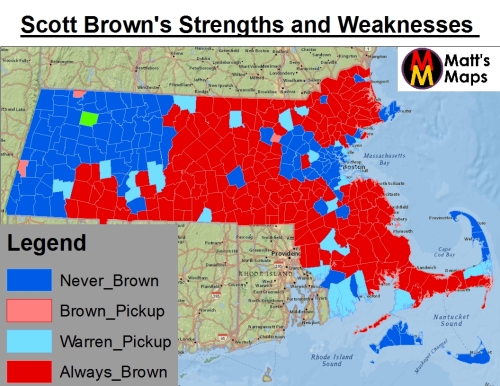
Despite Brown losing ground in 2012, the biggest losses came in shrinking margins, not a conceding of entire towns/cities. Brown won many of the same areas, in both races; with 2012 simply seeing him get smaller margins and losing likely democratic towns. However, the map below shows little variation in how towns/cities have voted overall when Brown is on the ballot. Largely towns have either always voted for Brown or never have. There is a handful of towns that defected from Brown, and just a few that moved to Brown.
The map below shows which towns always or never voted for Brown in his two senate campaigns.
–
The map shows a pretty clear divide, with only a handful of towns switching sides between 2010 and 2012. Warren’s pickups were significant, as the light blue towns represent over 500,000 registered voters. However, the margin of the win also came from eating into Brown’s margins in the cities/towns he always won.
Overall there is a clear divide in any election where Brown is on the ballot. Independent dominance means that an election can swing either heavily to Brown or against, depending on issues and candidate appeal. Perhaps though, there is another metric to help determine the likelihood of a city/town voting a specific way in a competitive race. For that, I look at something other than partisan strength and registration. For this I will look at religion: specifically Catholicism, in Massachusetts.
–
Catholicism in Massachusetts
Massachusetts has the reputation for one of the most liberal states in the nation; but it is also the most Catholic. The state is around 54% Catholic. While this distinction clearly means that the Catholics of Massachusetts don’t fall in line with Catholic social doctrine (which is much more conservative), the Catholicism of the state can still give an insight into how moderate Republicans can make gains in the state by appealing to the religious sensibilities of the voting populous.
Religious data can be harder to come by that another demographic statistics. Religious affiliation is not part of the US census, and is rather collected from he American Community Survey and the works of religous groups. There is no town-level data, but there is county level. The map below shows the counties of Massachusetts and the percent of them that is Catholic.

–
The most heavily Catholic counties are in the southeast, the same areas that voted for Brown. However, the Senate races are not the comparison being looked at for this. Rather this section looks at a referendum that took place in 2012.
Referendum 2 was on the ballot right alone with the Brown v Warren senate race. The referendum would have legalized doctor-assisted suicide for terminal patients who requested it. The measure was HEAVILY opposed by the Catholic Church, which invested money and manpower into battling against the measure. There was a divide in the state, but the measure could have likely passed if the church had stayed out of the race. Instead, the measure failed 49% to 51%.
 –
–
There is a significant correlation between the vote against the referendum and the catholic population of the counties. The scatterplot below shows that as the Catholicism percent for the counties increased, support for the referendum fell.

–
So we see that Catholicism and referendum vote had a correlation to each other. While I do not have data on Catholicism by town/city, I do have the results of the referendum by town/city.

–
After seeing several maps of Republican strength (and especially Scott Brown strength), this map is sure to look familiar. The referendum failed in the same areas Brown and other Republicans have polled well, the southeast, parts of the northwest, and the middle of the state.
Lets compare the 2012 referendum vote to the 2012 Senate vote. Warren obviously had to win areas were the referendum failed, and Brown won some areas were the refernedum passed. However, both candidates largely had marginal crossover when it came to the referendum.

–
The red towns are ones that voted for Brown and for referendum 2, while the blue voted for Warren despite voting against the referendum. In total, 101 towns/cities crossover in one way or the other out of the 351, so less than 1/3. Over 2/3 of cities/towns had the same preference for Senate candidate and the referendum, showing a correlation between the referendum vote and the vote for Senate.
The scatter-plot below shows that as support for referendum 2 decreased, support for Scott Brown increased. The correlation is not overwhelming but still significant, with several outliers, but an overall trend.

–
The trend is visible, but there are many outlier towns that voted against the referendum but still for Brown (showing Brown’s crossover) as well as anti-referendum towns that voted for Warren. But the bigger trend is visible as towns that start in the upper left and work there way down to the center right (signifying an increase for Brown as support for the referendum fell).
The same scatterplot using Scott Brown’s 2010 percentages shows an even better correlation, however.

–
There are fewer outliers this time, and a more clear slope. Due to Brown winning more areas, towns that voted against the referendum but still voted for Warren didn’t exist. Rather, Coakley had less appeal in the anti-referendum areas.
Brown isn’t the only one with a correlation to the referendum vote. Republican Gubernatorial nominee for 2010, Charlie Baker, also saw his support increase as referendum 2 vote decreased.
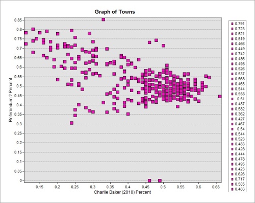
–
The scatter plots and maps show a correlation between Catholicism and the referendum vote and the referendum vote and partisan appeal (specifically with a strong republican like Brown). Thus, Catholicism itself can be a possible indicate of partisan leanings in a competetive race. This of course does not mean any Republican running has a basement of support, or a Republican can be very conservative. Rather, it indicates a moderate Republican can have appeal with the independent, and Catholic voters who are liberal leaning but considering they vote Democratic in most races, feel very comfortable voting for a moderate Republican like Brown to satisfy their moderate and sometimes right-of-center leanings on specific issues.
–
Conclusion
Overall, Massachusetts is, and will continue to remain, a Democratic stronghold. Republicans will perform better in gubernatorial and state cabinet races than federal races due to the overarching willingness of people to cross party lines on officials they are not sending to DC to cast votes. While Romney and Baker had some statewide appeal, they would likely be crushed in federal races for Senate. Scott Brown offered a unique appeal that crossed into federal elections. Brown could likely win the 2014 Gubernatorial Election, but in opting for the Senate seat, his chances are less than with the governor’s race, but still even money (and better of a battered Democrat emerges from the primary). Brown winning would come from big wins in the Catholic areas (perhaps campaigning on government overreach dealing with contraception or religious freedom).
Brown’s strengths lie in the southeast, middle, and parts of the northeast. Democrats do well in the west and in the Boston metro areas. Democrats need to work to hold into the towns/cities that Warren won in 2012 that Coakley did not. In addition, tamping down Brown’s margins in his strongholds will also be important to diminishing his lead. Campaign strategy should focus on the need to keep the Senate seat in Democratic hands. However, Democrats need a strong and likable nominee. It is not good enough to simply focus on a strategy of “you like him/her, but they are of the wrong party” (Republicans tried that in the 2012 North Dakota Senate seat and lost). Democrats will need a strong and credible challenger. The primary campaign, if it indeed becomes a major battle, must stay positive, with Democrats not attacking each other. A primary campaign could help Democrats build the name recognition of their candidates; provided it stays positive. While the primary goes on, the DNC and DSCC need to be involved, building a ground infrastructure to boost Democratic turnout, and if needed hitting Brown for controversial votes. Let the Democratic candidate remain positive as long as possible.
Part of the problem in 2010 was Democrats sleep walking the race. By all accounts are they will not make the same mistake this time. Scott Brown is a strong and formidable challenger, but with Obama pledging to campaign for the Democratic nominee Brown may not have the pull to get over 50%. Democrats have a good shot at holding the seat, but mistakes or complacency cannot happen. Scott Brown is a formidable candidate and can easily replicate the events of 2010 if Democrats are not careful.
–
UPDATE: Congressman Ed Markey enters
Sense my original post, congressman Ed Markey has entered the Democratic primary for the senate seat. Markey has been a member of the house since 1976, representing the areas north of Boston. Markey has rarely faced a serious challenge and is a high-profile liberal member of congress. Markey’s signature issue has been environmental causes, and he was the co-author of the 2009 Cap and Trade Bill that passed the house. Markey’s role as an environmental advocate parrells with Elizabeth Warren’s role as an advocate for consumer issues and banking regulation.
Markey has already received the endorsements of the Democratic Senatorial Campaign Committee, John Kerry, and Vicki Kennedy; making him the clear front-runner in the Democratic primary. Markey will be a strong candidate against Brown. He has routinely won nearly every city/town in his recent re-elections.

 –
–
Its not that Markey’s districts are democratic vote-sinks either. The congressman’s district (old and new) has held towns that voted for Scott Brown in either 2012 or 2010. Overall, these towns which voted for Brown also gave their votes to Markey.

–
The map above shows several towns voted for Markey in either 2012 or or 2010 while also voting for Brown at different points. Only one town in his district, Lincoln, has shown a willingness to vote against Markey and vote for Brown (granted it voted for Markey half the time).
Markey represents a strong candidate for the Democratic Primary, where his liberal credentials will make him a strong favorite. His environmental activism gives him a strong biography for the liberal state. In a general election matchup against Brown, he stands a strong chance of prevailing.
Mapping Same-Sex Marriage in Minnesota
November 6th 2012 was a turning point in the fight for same-sex marriage in the United States. In addition to the election of the nations first openly LGBT Senator (Tammy Baldwin in Wisconsin), the election of several new LGBT candidates to the US House, there was the successful gay-rights referendums in four states. Maine, Maryland, and Washington passed referendums to legalize same-sex marriage, while Minnesota voted to block a constitutional ban to same-sex marriage (which already is statutory-illegal in the state). The three pro-gay measures marked the first time same-sex marriage succeeded on the ballot, a huge victory for the gay rights movement. However, the vote to reject the ban in Minnesota perhaps has equally important connotations. Minnesota’s vote showed a strong win in a Midwestern state, an area perceived to be hesitant toward same-sex marriage. In addition, the rejection of the ban in the state has embolden gay-rights supports in the state. Back in 2010, when the state elected a Democratic Governor, Mark Dayton, gay-rights supports were hoping for civil union legislation in the state. However, in a cruel irony, the legislature turned Republican that same year, ensuring no civil union legislation would be brought up. Taking back the Minnesota legislature was a big step toward a civil unions bill. However, now that the ban but up by the Republican-legislature has failed, supports of civil unions appear embolden to go for full same-sex marriage instead. In addition to the ban being stuck down, the legislature became Democratic again. With a same-sex marriage ban rejected statewide, an a fresh Democratic legislature and governor, the chances for actual same-sex marriage passage in the state is as good as ever.
–
2012 in Minnesota
Liberals had a good night in Minnesota in the 2012 General Election. Two conservative ballot measures (gay marriage ban and voter ID for voting) were defeated, and the Democrats regained the legislature. The Republican had won control over both chambers in 2010, despite losing the gubernatorial election to the democrats. However, 2012 marked a good year for democrats, who won back legislatures they had lost in 2010 across the country (except the south). Thanks to Governor Dayton vetoing Republican gerrymanders during redistricting, the courts were forced to draw a neutral map. Democrats won under the new lines, making large net gains. The first map below shows the results for the state house elections.

Dems made gains across the state, in rural zones, and as the zoom in map below shows… the twin-cities metro area

–
With these gains, including Democrat expansions in the suburbs of the twin-cities, the party now controls 73 of the 134 seats in the state house.
Democrats made stronger gains in the state senate, getting to 39 of the 67 seats, an even bigger percentage than the one they have in the state house. As with the house gains, senate seats gains were across the state

–
Dem gains were also especially prevalent in the the outer areas of the twin-cities metro area, where 9 of the gains made were in that region.

–
On the same night Democrats gained back the legislature, the referendum to ban gay marriage went down in defeat. The measure had been close in the polling through most of the year, and the measure faced a steeper climb because blank votes are counted as no in Minnesota. Still, considering the Midwest is still a tossup on same-sex marriage, there was a definite chance the measure could pass.
On election night though, the measure failed.

–
The map above color-coded as the percent in favor of the ban (so green, under-fifty, reflects a rejection of the ban). The ban failed in only a handful of counties, but the those ones were where the population for the state is focused.
The map above focuses on the county breakdown of the referendum, but another way to look at it is the breakdown by legislative district. The Minnesota Elections Office conveniently breaks down the statewide results by legislative district. This way, the new legislators can see how their district voted on the ban, which could affect the determination of a lawmaker debating whether or not to vote yes or no on a same-sex marriage bill.
First lets look at the state house.

–
More than half the districts voted against the marriage ban (green). While the map looks mostly red, that’s because a large swath of small districts exist in the twin-cities region.

–
The strongest rejection of the ban came right in the St Paul and Minneapolis urban centers, which includes college communities. Even the suburban zones (the light green area) rejected the ban.
Next, looking at the the state senate seats, we see again that a majority of the seats voted against the ban.
 –
–
The same regional breakdown occurs on the seat map than the house map. House seats are combined to form one senate seat in the state, so the regional similarities is not a surprise. A zoom in of the twin-cities metro area again shows were most anti-ban seats are located.

–
Again, the ban failed worst in the center of the metro area, with the suburbs also rejecting the ban.
–
So, based of the 2012 general election results, there appears to be a good chance for marriage equality legislation in the state. Democrats made strong gains, and the amendment failed in a majority of the districts. However, not all these districts rejecting the ban where Democratic; and some democratic seats voted for the ban. In order to look at an actual legislative vote, we must handicap both chambers of the legislature on a potential vote.
–
Handicapping the State House
First lets take a look at the state house, which might actually be a tougher haul because Democrats margin (54%) is lower than the state senate (58%). Using the 2012 election results and the referendum to ban same-sex marriage, I have put each district into distinct categories of likelihood of voting. A few things to mention here. This analysis is base entirely off party ID and the amendment results. It does not factor in how hard Democratic leadership will push their members, or how hard Republicans will try to keep their members in line. How the whip count goes will have an effect on voting. This analysis simply categorizes how each district breaks down. Leadership takes these factors into account when trying to recruit votes for a bill.
Categorizing districts
- Democrats in super pro-gay areas — these lawmakers are Democrats in districts that gave the ban less than 40% of the vote. These lawmakers would be under intense pressure to vote for a marriage bill, or risk a primary challenge.
- Democrats in pro-gay areas — the lawmakers are Democrats who reside in districts that voted against the ban but over 40%, they are also strong candidates for voting yes.
- Democrats in tie areas — Democrats where the district tied on the ban, leadership will pressure them for a yes vote, they are in the “lean” category.
- Republican in gay friendly — These Republicans,almost all in the twin-city suburbs, have districts that rejected the ban, mostly between 39 to 49%. They are tossup votes. Some will worry of right-wing primaries, while others will worry about general election implications. Some may simply say they are reflecting their constituents wills.
- Democrats in anti-gay areas — These democrats represent areas that voted for the ban, but under 60%. Leadership will pressure whom they must if they are serious, but these lawmakers are tossups.
- Republican in ban tie — This type of district has a Republican in a district that split down the middle on the ban. They are a lean no because of the risk of a primary.
- Democrats in super-anti gay area — These democrats reside in districts (largely rural) that voted for the ban over 60%. Unless leadership demands it, getting a yes vote from these lawmakers would be very tough.
- Republicans in anti-gay areas — These lawmakers will have no incentive to vote for a gay marriage bill. They are strong no.
Based on these categories, the map below shows how each district is labeled.
 –
–
Democrats need 68 votes in the state house to pass a bill, and already 58 votes fall into the lean or strong yes category (dems in pro-gay, super-gay, or tie areas). This leaves 31 swing votes (rep in gay friendly or dem in anti-gay area), of which only 10 are needed.
Lets zoom into the twin cities metro area to look at these swing votes

–
This ring of republicans is 21 of the 31 swing voters. These lawmakers represent areas that voted against the ban, the ring of suburbia surrounding the twin-cities. These voters are fiscally conservative and voted Republican for legislature, but tend to be socially more liberal. They will expect their lawmaker to be reasonable on social issues. These representatives are prime picking for getting additional yes votes. Most of these members are not newly elected, and may feel a degree of comfort in voting yes and not worrying of a primary challenge.
–
State House Overall Assessment
The Democratic leadership has a decent chance of passage. Democratic leaders need to ensure all 58 of the lean or strong yes votes actually cast ballots in favor of the legislation. In addition, Democrats will need to get some votes out of their Democrats in anti-gay areas, and supplement the rest with suburban republican lawmakers. Without Republicans, dems would need to get all their anti-gay area democrats on board, and 1 or 2 dems from very anti-gay zones; an unlikely feat. Getting the votes just from the Democratic caucus could be difficult, so getting votes from the suburban republicans can shore things up.
–
Handicapping the State Senate
Handicapping the state senate is done the same way as the state house, with the same categorization. Just reference the list in the state house section above to learn more about the classifications and to see which classification falls into yes/swing/or no. Based off the criteria, here is the map of the state senate districts below.

–
Democrats need 34 votes to pass the measure, and already are at 29 with the lean and strong yes votes. They need 5 votes from a pool of 18, and again, part of their answer may lie in the suburbs of the twin cities.

–
With 5 votes needed, some or all could come from the 7 suburban pro-gay, republican-occupied districts surrounding the twin cities. Democrats can try and get votes from these moderate districts. The party has more flexibility in the senate than the house due to their larger margin. Democrats have 7 members in anti-gay districts, and would only need 5, and need none from the super anti-gay districts. However, getting votes from the suburbs would allow the party to protect their own members from tricky votes.
Overall State Senate Assessment
I’d say Democrats have a better chance in the state senate than state house, although both are winnable or lose-able Democrats have more cover in the senate due to a larger majority, while the house is a bit tighter.
–
Overall Assessment
I would say that if the Democratic leadership and reasonable popular governor Mark Dayton make a strong push for same-sex marriage, it can pass. Democrats will be kept largely in line, and help from the suburban republicans who will need to be pressured by constituents to obey the will of their districts, to get this feat accomplished. It will be a tough haul, but is a winnable won, just like close legislative votes in the past. With strong force behind it from the political leaders, marriage-equality in Minnesota could easy be in the states very near future.
Florida House District 7: Last Stand of the Dixiecrats
For anyone who has been following my blog, I have commented on the phenomenon of the ‘southern realignment,’ a trend that began in 1964 at the federal level were Republicans began to make huge gains in the southern states as the Democrats improved in the North. The shift was drastic at the Presidential level at first, and began to slowly but surely continue at the congressional level over the next 40 years. At the same time, state-level and state-legislative elections told a different story, with Democrats retain control of southern governorship’s and legislative bodies. Gubernatorial elections began to shift back and forth between the parties, but legislatures in Alabama, South Carolina, North Carolina, Georgia, Mississippi Alabama, Louisiana Tennessee, and Arkansas remained overwhelmingly Democratic. However, the Republican trend eventually took hold, especially after the 2008 elections at the local southern level. The history of this shift can be found here in a past blog entry of mine, https://mattsmaps.wordpress.com/2011/07/14/southern-realignment-nears-completion/.
The realignment toward the Republican Party has now completed itself in all Southern States except for Arkansas, with Alabama and Louisiana shifting in 2010, and Mississippi shifting in 2011. Now in 2012, Democratic hopes to reclaim these southern state-houses is low, with the party in shambles in Alabama/Louisiana/and Tennessee. Democrats appear doomed to lose the North Carolina Governorship, and several Democratic congressman are fighting to hold onto their southern districts. I will be also watching to see if Democrats lose more seats in Arkansas, which will not come close to voting for Obama this year. In fact many independent analysis’s anticipate Arkansas to fall to the Republican Party, while Tennessee Democratic just a few years ago, is likely to move to super-majority Republican. In keeping with this watchful eye on Republican gains in the south, I am taking a look at another southern seat right here in Florida.
In the panhandle of Florida lies Tallahassee and Gadsden county… two reliable blue counties, but surrounding them is a vast sea of old-school southern tradition. The Florida Panhandle holds many similar traits to the American South, both in culture and politics. The counties around Leon and Gadsden are heavily Democratic in registration, but vote Republican on the top of the ballot. Many of these counties still have local Democrats in office, but even those trends are fading. With redistricting, a new State House Seat was formed, HD7, which combined HD10 (a dixiecrat style seat held by Democrat Leonard Bembry) and the old HD7 (held by Republican Marti Coley). The new HD7 is heavily Democratic registration wise, and is an open race between a new-to-politics Republican and a long-time dixiecrat from Liberty County. This race is the ideal seat for Dixiecrats to hold, or for Republican to finally snatch away from the Democratic Party. There are no southern Democrats left in the Florida legislature once Bembry leaves at the end of the year. If Hill doesn’t win, then there will be no southern Democrat replacement for Florida. That is why HD7 is is the last stand for the Florida Dixiecrats. Will the fundamentals allow the Democrats to hold on, or is that southern realignment going to continue to talk hold in the South?
–
Florida House District 7: The Basics
Florida HD7 is a well-drawn section of the panhandle that loops under Leon/Gadsden Counties and encompass rural counties on the east and west sides. It is truly a rural district, with no major metro location or population concentrations. The district encompasses 9 total counties and some of the rural precincts in southern Leon. The map below shows the districts precincts. Note that the light-grey precincts are those that used to be the hold HD10, held by southern Democrat Leonard Bembry. We will get back to the old HD10 later.
 –
–
This district is large regarding land size, but again most population is split up. Much of the land in these counties is open forests or farmland. Liberty county to the west is actually the least populated county per square mile in the entire state.
–
House District 7: Partisan Breakdown
HD7 does not vote Democratic at the top of the ballot, it just does not happen. It takes a huge Democratic sweep (such as Bill Nelson in 2006) to actually carry HD7. President Obama was crushed in the district, while Alex Sink, the 2010 Gubernatorial nominee, who had one of the best panhandle performances for any Democrat in some time, still couldn’t win the district. For analysis I focused on three recent elections (going back too far will pollute the study because of the constant southern shifts in voting attitudes): 2008 President, 2010 Governor, and 2010 Attorney General. The 2010 AG race was chose because it was a lower-ballot cabinet seat where party loyalty easily comes into play, and neither candidate had ties to the region.
Lets look at the results for these three races

–
As you can see, Obama lost overwhelmingly across the precincts, only polling in wins in parts of Madison, Jefferson, and a few other sporadic areas. Precincts he won in Gulf, Calhoun, and Liberty were ones with significant African-American populations (but we will get back to race later).
Next lets look at 2010 Governor

–
Here we see Democrat Alex Sink doing much better than President Obama. As discussed in my article on the Florida panhandle linked above, state-based Democrats over-perform federal candidates in this rural region of the state, so that no doubt plays in. The question of racial motivations were also looked at in my Florida panhandle blog, so we won’t get into that here. Nevertheless, the proof is clear that Sink had much stronger appeal, only losing the district by 3. She kept Scott’s percentages lower in many precincts; won strongly in Jefferson and Madison, and took many precincts in Wakulla. Sink came the closest to winning HD7, but still came up short.
Finally, we look at the 2010 AG race, where Dan Gelber lost to Republican Pam Bondi

–
Gelber did not do as well as Sink, suggesting Sink had more going for her (certainly a flawed Republican in Rick Scott) than Gelber did. Gelber still did better than Obama in terms of margin, and won many more precincts.
–
With these three races, lets look at which precincts always voted Democrat versus Republican

–
The results are clear, there are far more precincts that Always voted Republican in those three races than those which voted Democratic. In fact, the red precincts represent 47,000 registered voters, while the blue only represent around 13,500. Clearly when it comes to state-wide campaigns, Republicans have the clear advantage.
The above map shows which precincts always went with which party. If we narrow this down to include leaners, we continue to see a Republican advantage. For Democrats we removed Obama’s election (their worst showing) and for Republicans we removed Scott’s election (their worst showing). The result added in precincts that lean Democratic or Lean Republican.

–
This map shows that all precincts fall under either Democrat or Republican (lean or always) regarding the state-wide races. No precincts showed themselves as being completely swing precincts, everything had a lean toward one party or the other. That’s not good for Democrats, as a clear majority of the districts population lies within Republican-affiliated precincts. In order for Democrats to win in the district, they need a candidate with especially strong crossover appeal, one who can makes gains in not just Lean-Republican precincts, but also in those precincts that always vote Republican further up the ballot.
The state of HD7 partisan-wise is truly striking, considering Democrats enjoy a very significant party registration advantage. While registration in the south (and thus in North Florida) is not as strong a predictor of voting trends as other areas (with the classic southern-tradition Democrats voting Republican but still staying registered Dem), HD7 has a very significant registration advantage for Democrats.

–
Democratic registration is a 40 point advantage in the district, with only the rural precincts of Leon County having the most significant concentration of Republicans. Otherwise Democratic registration is overwhelmingly dominant, despite the partisan nature of the district. Indeed many of the precincts that are overwhelmingly Democratic are also the least loyal precincts to the Democratic Party.
The map below sheds further light on registration in the district. The map below is a proportional-dot map that shows the Dem and Rep precincts, with the size of the circle reflecting the total number of voters for that party. For example, a blue precinct represents a Democratic-majority county, and the largest circle means that it has up to 1,000 registered Democrats for that precinct. A red precinct with a circle reflects the total number of registered Republicans.

–
The map above shows that there are way more total Democrats than Republicans, spread throughout the district. There are no major population hubs, with the Democratic edge spread throughout the land of HD7.
In the image below, I took the precincts that always voted Republican, and looked to see which ones where heavily Democratic. Precincts in dark red always voted Republican yet have Democratic registration over 60%, while precincts in the lighter red always voted Republican yet had Democratic registration over 50%.

–
Democratic registration is clearly not a sign of Democratic loyalty. In fact, while President Obama got over 90% of Democrats nationwide in 2008, he did not do nearly as well in HD7. This can be best illustrated from the scatterplot below. The dots represent each precinct in HD7. The x-axis represents the percent a precinct is Democratic, and the y-axis represents the percent of the vote Obama won in 2008. The top right grid represents precincts Obama won and were majority-Democratic. As the plot shows, only a few precincts fell under that category.

–
As the scatterplot shows, a majority of the precincts fell under the plot that had Obama lose despite the precincts being over 50% Democratic.
–
Racial Component to Democratic Strength
Indeed, about half of the precincts Obama won that were over 50% Democratic were those that were also largely African-American. Only a handful of precincts majority-white went for Obama… all of those with significant African-American minority populations. However, their are only a few African-American precincts, hardly enough to give Democratic candidates a significant edge.

–
As the map above shows, a vast majority of the precincts in HD7 are not only majority white, but most are over 70% white. This does not bode well for most Democratic candidates, as their share of the vote decreases as the percent of a precinct grows in terms of white population. Look at the scatterplots of both Obama and Alex Sink to see how they performed in relation to the white percentage of a precinct.


–
Both graphs, but especially the Obama graph, show a clear decrease in the percent of the candidates vote as the percent of the white population increases; with only a few outliers precincts on display.
In fact, lets see on the map how many white precincts actually voted for President Obama in 2008. The map below shows precincts Obama won that were majority white, and another category for those over 60% white.

–
As we can see, only a few precincts meet this criteria.
Next looks look at how Gelber did among white voters.

–
Gelber definitely did better, picking up many precincts in Jefferson County.
Finally, lets look at Alex Sink, the best performing state-wide candidate for this region.

–
Sink by far did the best, picking up white precincts across the district through Leon and Wakulla and a few in Calhoun and Liberty. However, the fact she lost the district is evident in the fact that she still couldn’t make big ground in Franklin, Calhoun, Madison, or Taylor. Without a candidate making ground there, they have no hope to win the district overall. For a Democrat to win in the district, they need to get back the white southern Democrats who have been leaving the party over the last several decades. However, all is not lost, as there are examples of Democrats garnering that kind of support needed to win. No more recent example exists than that of state representative Leonard Bembry.
–
Model for winning: Leonard Bembry
Leonard Bembry is the current state Representative for House District 10, which has now been broken up in redistricting, with parts of it now in the new HD7 (refer back to the original base map at the top of the this article). Bembry’s old HD10 seat was no more favorable to Democrats than the new HD7 was. The old HD10 gave Obama around 38% of the vote, yet Bembry won the open seat in 2008 and held it by a double-digit margin in 2010 during the red wave. Bembry represents true southern conservative Democrats, and because of that was able to win such a seat. The map below shows the precincts he won in his 2008 election (only the precincts in the new HD7 are shown.. there were more counties to the east in HD10 not displayed here).

–
Bembry won handily in all counties except Franklin. His strong showing in Taylor is especially striking.
Then, lets look at his 2010 win, were he staved off a challenger by an even larger margin despite being in the midst of the red wave year.

–
Bembry did much better than other southern democrats in 2010, gaining from his 2008 numbers, and winning most precincts in those that fall under HD7.
Overall Bembry did very well in this mass of precincts. He always won most of them, and only never won a handful. The map below shows the precincts color-coded based on how the leaned in the HD10 races of 2008 and 2010.

–
Bembry overperformed compared to other Democrats because he was able to hold onto white southern voters. In both 2008 and 2010 he won many more white precincts than any of his other Democratic colleagues. The 2008 map below shows the precincts he won that were 50% white or more.
 –
–
The next map shows his 2010 results among majority-white precincts

–
The scatterplot below also shows how well Bembry performed with white voters. He took many more white precincts available to him than any other Democratic candidate.
 –
–
Bembry overwhelmingly won white precincts in just his 2008 run, even more so in 2010. He is the strongest performing Democrat to in recent years for the region. The graph below highlights just how much Bembry in overperformed President Obama. The graph below shows the precincts that always voted for Bembry. The red line shows the percentage line for 50%, and the blue bars represent Obama performance in each of these precincts. As seen, Obama mostly fell well under 50% in these precincts that, again, ALWAYS voted for Leonard Bembry in the general election.

–
The data shows Bembry’s strong cross-over appeal into the white conservative Democrats that are moving further and further away from the national Democratic Party. For Democrats to hold the new HD7, they need a candidate with that same appeal.
–
2012 Election
The 2012 election featured the potential for a very interesting showdown. Republicans nominated Halsey Beshears, a newcomer to politics, while the Democrats nominated Robert Hill, the Clerk of the Court for Liberty County. Hill is the traditional conservative southern Democrat, and on paper is a strong candidate against Beshears. Hill was elected as a Democrat in Liberty in 2000 and was unopposed ever sense. He faced a three-way race for the nomination for HD7, and won with 40% of the vote.

–
As the map shows, Hill (blue) won thanks to strong wins in the western part of the district that Democrats have fared poorly in before. He won up to 80% in Liberty and Calhoun areas. These same precincts Hill won big are overwhelmingly Democratic in registration, so Hill has already garnered support in the primary that easily transfer to the general (although not guaranteed). The results should give Democrats hope that Hill can win in November.
Unfortunately, the reality of the situation has been money. Beshears has proven to be a powerful fundraiser, and also has a SuperPAC behind him. In addition, the Republican Party has pushed hard for Beshears, while the Florida Democratic Party has not put much focus on the 7th house district. Hill is finding himself underfunded and swamped against Beshears’ advertising, which is focusing on a moderate message. Hill is no doubt the underdog in this race due to the uneven balance of money. However, Hill demonstrates strong support in the western counties, and if he can hold that past the primary, and do well in those precincts that remained loyal to Bembry, he just may pull it off. Bembry also was outspent in 2008 and still won the race, so all is not lost in regard to Hill pulling off a win. If he does, it will be thanks to the overwhelming Democratic registration advantage and those same Democrats sticking with Hill more than they will for Obama. If Hill wins, the Dixiecrats will live on. If Beshears takes it, Dixiecrats will suffer another major blow in the panhandle. And as trends in the deep south have shown, these blows are not easy to recover from.
Florida’s Panhandle: Does race or party sink it for Obama in the southern north
Ever since I was a child, born and raised in the urban and Democratic heartland of Broward County, Florida; I have heard the old saying, “Florida is the only state where you need to go north in order to get to the south.” This isn’t so much a reference to the fact that if you go north you will hit the Georgia border, but rather a reference to Florida’s panhandle, the rural and socially-southern area of the sunshine state. Florida is a unique and diverse state, characterized by a urban and suburban centers along the coasts of the peninsula, open lands of Everglades, farms, and rural communities in the center, and booming cities that are growing in the center (Orlando, Winter Haven, Gainesville). However, when we get into Florida’s northern stretch, we enter a more southern dynamic. This is the area of Florida that used to be the only populated parts of the entire state, the area that was part of the confederacy during the civil war. The traditions and roots of the panhandle, from Jacksonville to Pensacola, have a longer history than the area’s to the south, which used to be nothing but wetlands until the early 1900s, when Flagler’s railroad was built and allowed for smooth travel to Miami (followed by a slow process of draining the wetlands and urbanization). The panhandle tends not to be a reference for the counties that go all the way to Jacksonville, but rather they stop around Madison county. The typical counties covered under ‘panhandle’ are colored red here.
 However, panhandle is an unofficial term, and for the purposed of discussing this, the region I refer to will include counties past Madison county, but not as far as Jacksonville on the east coast.
The panhandle region, as stated, has a unique history, which lends itself to unique voting habits and politics. Like much of the south, the panhandle is still largely Democratic in registration. Only counties to the very west are more Republican than Democrat from that region, which are largely rural, settled a bit later than the civil war, and Bay County, the big coastal county that is home to republican Panama City. Otherwise, the counties of this region aren’t just Democratic, they are overwhelmingly Democratic registration.

–
The registration map shows a strong base for the Democratic Party in the north. However, these counties do not vote the way their registration would dictate in most state-wide elections. The region continues to move further and further away from the Democratic Party. This phenomenon is one taking hold throughout the south. Ever sense the 1964 Presidential Election, the Democrats have been losing ground in the south due to their support for civil rights laws. The panhandle region, again being culturally similar to the south, shows the same trends as Georgia, Alabama, Mississippi, and other southern states. Look to this map generated, that, using several past state-wide elections, calculated what the party-leaning for each individual county is.

Democratic strength in the state for recent years as relied on a few key area. The populous southeast of Broward, Miami-Dade, and Palm Beach: the Orlando/Tampa/Daytona Beach areas, Gainseville, and the Tallahassee Metro area in the north (Leon County, Gadsden County, and Jefferson County). Democratic strength lies in the urban centers, and is terrible in rural zones, including the panhandle. This again, is despite the the panhandle holding such a huge democratic registration advantage (much bigger than any of the rural counties in the southern portion of the state.
=
Electoral History
Now, the this blog entry is not about Democratic strength in the state of Florida overall, but rather, about Obama’s performance in the panhandle of the state. The reason this issue is brought up is for a very specific reason: Obama is one of the WORST performing Democrat in the panhandle for the last 8 years (only beating 2006 Agriculture Commissioner nominee). The President, despite winning Florida in 2008, had the worst performance in the panhandle region over several other Democratic candidates sense 2004, many of whom performed much worse statewide. The understand what I am saying, let me tell you some of the past elections I am looking at to judge party loyalty.
- 2004 Presidential Election (John Kerry gets 47% in a hard fought race to try and win Florida)
- 2006 Gubernatorial Election (Jim Davis gets 45% in a blue year, but with an underwhelming and underfunded campaign)
- 2008 Presidential Election (Barack Obama wins 51% in a high-profile contest, race wasn’t called till past midnight)
- 2010 Gubernatorial Election (Alex Sink gets 47% in a close loss that wasn’t called till the next day)
- 2010 Attorney General Election (Dan Gelber loses with 41% by getting caught up in a red year)
These five races are key to me judging how the panhandle votes in recent years. So why did I chose these races? First, I chose the two Presidential races to offer a contrast for how different federal candidates performed, and chose both Gubernatorial election to also show a contrast for state-wide Democrats who aren’t federally-linked. The cabinet races (Attorney General, CFO, and Ag Commissioner) are too low profile and unpredictable in terms of regional strengths to be a reliable indicator of party strength. The reason I use the AG race from 2010 is strickly to judge how well Gelber (who lost badly) performed in the panhandle compared to Obama, who won. You will see what I mean shortly. Another item to point out, many reading this blog will likely understand the “federal verses state” issue I refer too. Sometimes, a state or region may always vote a specific party for federal races, but vote different for state-based races (West Virginia, Arkansas, North Carolina: are prime examples). The panhandle in Florida is no different. Like most of the south, it may still vote Democrat on a state race level, but gives less of the vote to federal candidates. I took these five races and garnered the average results for state candidates and federal candidates, and mapped which counties had federal democratic candidates do better, or which had state democratic candidates do better. Results below..

As we can see, a large swath of these panhandle counties give Democrats more support for state-based races than federal. The two green counties in the middle of the pink, Leon and Gadsden, are Democratic strongholds in the region. Leon is home to liberal Tallahassee, while Gadsden is majority african-american. Otherwise, the panhandle is less kind to federal democrats than state democrats.
Lets now take a look at how these five races I am studying actually voted.
First, lets see how President Obama did. As the map below shows, his strength in the panhandle was limited to the Democratic loyal counties of Leon/Gadsden/Jefferson.
 –
–
Next, lets look at the 2004 Presidential election, where John Kerry lost. Kerry didn’t win any extra panhandle counties, but did get a higher percent of the vote in those counties than Obama.

–
Then, lets look at the 2006 Gubernatorial race, where Davis lost the state, but did pretty well in the panhandle.

—
Next we look at the 2010 Gubernatorial election, where Alex Sink, despite losing statewide, had the best panhandle performance

–
Finally, we look at the 2010 AG race, where Gelber, swept in a bad democratic year, did bad everywhere except the most Democratic of counties
 –
–
–
Analyzing The Results
Ok, so we have these races, now lets do some analysis. With all the data at my disposal, I had my ArcMap software calculate Democratic gains between different races. So for example, between the 2004 and 2008 Presidential elections, which counties saw Democratic percentages increase, and which saw a decrease. This was the first map I generate. Look to the legend, the blue counties show where Obama improved on Kerry, while the red show where Obama did worse.

Obama gained in most counties, but lost ground, in other areas, especially the panhandle, where he lost anywhere from 5 to 10 points.
Ok, so this is one race, need more proof than that. Well lets see how Obama performed compared to Davis, who only got 45% in 2006, compared to Obama’s 51%

Speaking truth to the testament the panhandle performs better for state-based Dems than federal, Obama lost even more ground from Davis than he did from Kerry But again, these margins are high! Up to 20% dropoff in some precincts, several of them in the panhandle.
Lets look at the 2010 Gubernatorial election. Sink did worse than Obama, so her GAINS from Obama should be minimal in any counties (she lost ground in most).

Again, we see that Sink outperformed Obama in the panhandle, losing ground in much of the state, but gaining up to 20% in several counties.
Finally, lets see how Gelber compared to Obama. Surely Gelber, who only got 41%, couldn’t outperform Obama in the panhandle, even with his advantage as a state-dem and not a federal one.

Nope, even Gelber gained ground in the panhandle, despite losing it badly elsewhere. Gelber’s result compared to Obama offer perhaps the biggest contrast. Obama underperformed state Dems in the panhandle, that can be expected because of the dynamic in that area, an afffinity to the federal democratic party. But Obama also underperformed Kerry, who lost the state. This gives a hint of a racial component to Obama’s bad showing in the Panhandle.
We can’t just chalk it up to racial issues, because again, federal democrats underperform state Democrats in the panhandle. Lets look at see if Davis gained votes from Kerry between 2004 and 2006. Remember, Kerry got 2% more statewide than Davis

–
Here we see, Davis also gained ground in the panhandle from Kerry, sometimes has high as 10 to 15 percent. HOWEVER, remember from the earlier map, Davis overperformed Obama by as high as 20%. So there is an extra 5% or so to be accounted for. Which is seen in the 2004 to 2008 map. Why did Kerry outperform Obama in the panhandle? Sure the slip away from federal democrats in the southern states (and north florida) continues, but Obama was a strong performer in 2008. The racial prospect continues to seem like a possible explanation.
One other comparison map to look at, we saw that even Gelber gained on Obama in the panhandle. Part of this can be attributed to Gelber not being a federal candidate. So wait, how did Gelber gain on Kerry?

–
Nope, Gelber unperformed Kerry in the panhandle. Such a result makes sense, as Gelber had such a low percent. Gelber only gained in a few rural counties, and Miami-Dade (his home base). But again, this gives further credence to the argument that Obama had an especially bad performance in the panhandle; as Gelber did gain ground on him in the panhandle, while Gelber failed to gain off Kerry.
–
Obama had a signficant problem in the panhandle. For these five races, Obama came in last in several counties, ALL located in the panhandle

This is a major question. Why is it like this for the President? Is it growing animosity toward federal democrats alone, or did Obama get punished for his race? More analysis is needed to determine that answer.
–
Was Race a factor?
So, it seem clear Obama unperformed in the panhandle. But how significant is the under-performance? A slight under-performance could be chalked up to a changing electorate. We need a significant difference in vote to give credence to a racial component.
To find this out, I first isolated key panhandle counties that showed a significant swerve from Obama to Alex Sink, who was our best performing democrat in the panhandle.

–
Then, I narrowed are margin further. We know state dems over-perform the federal ones. So I took out precincts where John Kerry didn’t do at least ONE PERCENT better than Obama. So if Obama and Kerry tied, or Kerry just barely did better, I removed those counties. Such counties could have seen the anti-Obama shift because of changing demographics. That left me with the following

–
These counties, 15 total, all saw Obama under-perform Kerry and most state Dems (except Gelber in a few). If there is a racial component to the voting, then it exists in these counties. I then graphed the results for all 5 Democrats. I used a specific color scheme for the different candidates. Shades of blue are for the state democrats, while orange and yellow are for our federal presidential candidates.
First, I looked at counties that had a Kerry advantage of 1% to 5%

Yellow is Obama, and he under-performs in most counties, except a few times edging out our tying Gelber. We can see our gubernatorial candidates slightly over-perform our presidential candidates and Gelber. Overall, this chart doesn’t tell us much. It reflects the general uncertainty of the situation. Does Kerry outperforming Obama by a few points really mean there is a racial reason for the voting?
To answer that, lets look at the remaining counties, six specifically, that saw a stronger gap between Obama and other candidates.

This chart, gives a starker visual, it shows Obama’s line under-performing all candidates (except with Gelber in Calhoun). Obama lost percents from Kerry in every one of those counties by 5% or more, a significant amount. While our gubernatorial candidates performed much higher than the rest, Obama’s lag at the bottom is most telling. In these counties the state v fed divide is very significant, but Obama loses extra points that Kerry did not. Look at the county statistics below, see how Kerry over-performed Obama. The biggest gap was in Liberty, where the margin was 8%.
| NAME | PRESKERRY | PRESOBAMA |
| Liberty | 35.40% | 27.20% |
| Calhoun | 35.50% | 29.10% |
| Lafayette | 25.40% | 19.00% |
| Taylor | 35.50% | 29.90% |
| Franklin | 40.50% | 35.30% |
| Holmes | 21.80% | 16.80% |
–
It is my belief that these extra percents Obama lost over Kerry have to have a racial component to them. Obama, despite being the only winning candidate in these 5 races, lost badly in the panhandle, but especially in these counties. He could even only manage a tie with Gelber in Calhoun, despite Gelber getting 10 points less statewide. While local surveys and studies would be beneficial to conclude these findings, the numbers definitely indicate a racial component to Obama’s poor performance in these 6 counties.
Polling on Same-Sex Marriage proves Obama is safe, and the trend toward equality can’t be stopped
On May 9th, 2012, Barack Obama announced in an interview that he endorsed the right of same-sex couples to gain full and equal marriage; and with that a political earthquake shook the very foundation we stood in. The reaction was mixed, diverse, and exciting. Many Democrats jumped in the bandwagon, Republicans awkwardly tried to stick to the economic message they have been on lately, pollsters rushed into the field to analyze the affect, and TV commentators had free reign to give their thoughts and opinions on the effect of the announcement on the President’s electoral standing as a result. Focus came down heavily on if the announcement would hurt the President in key states. Commentators rushed to talk about “all these states where its not popular, and ALL these states that have banned the practice. Surely the President is doomed! Ohio doesn’t like it, they won’t vote for him, he’s doomed!!” And thus the mindless sputtering began, where anyone with a camera in front of their face got to become a polling expert for a day. Where every newspaper got to go interview 5 people on it, and call it a representation of millions of people. “What’s that, some black preacher in Maryland won’t vote for Obama now? Well clearly this means he’s lost 100% of the black vote.” Anyone else see how stupid that sounds? Well to watch cable TV, you would get that impression. It was truly a stunning spectacle to watch. But never fear my data and FACT driven followers, I will break down all the numbers, and show that Obama is quite safe on this issue. The trends are moving in the right direction, key swing states are moving toward equality, and with the economy being the top issue, Obama is 100% safe on this matter.
–
State of the Union
There is alot of ‘concern’ among many that Obama is in trouble on this issue, that he is taking a risk that could harm him when all is said and done. They site things like all the states with ban’s on their books already, the popular myth that Bush won 2004 on gay marriage, and the fact that several swing states in the rust belt still aren’t singing hymns for gay marriage. But there speculation and concern falls upon my deaf ears for many reasons. Lets begin with the basics… some national polling recently.
First, lets take a look at our standard national polls… first gallup…

—
Gallup shows a continues move toward equal marriage. The good side peaked at 53, and has fallen a bit, but the 3 point diff from the last poll can be seen as a statistical question… after all.. these polls have margins of error. Its fair to say though, that under these numbers, equality is over 50%, if not right on it.
Then, we look at Pew Research, which also shows marriage support over marriage opposition, granted below 50%

–
Both of these charts show the same thing, a dramatic shift in attitudes over the last decade, or decade in a half. But we’ve seen these charts before… lets look at other numbers..
–
These numbers on marriage correspond with trends that show American’s view same-sex relations more and more as ‘morally acceptable’ This is one of the reasons that religion has become less of the divider on this than what age is now.

–
This gallup poll compliments the Pew Poll that breaks down marriage support by religious affiliation.

–
What we see here is key trends if you look closely. Religiously unaffiliated voters are of course the most strongly support of same-sex marriage. In addition, Jewish individuals support equality up to 60% (not reflected in the chart). But look at white mainline protestants and catholics. There as been a steady move up for them since 2001. Catholics seem to have dipped in support, but that may be a polling outlier (see how mainline’s dipped in 2009, but then quickly jumped back up). Catholics are still strong at 46%, and mainline protestants are over 50%. The mainlines are your Lutherans, Methodists, northern Babtists, Presbyterians, and other protestant groups that don’t identify as part of the evangelical movement. These groups make up significant share of the religious community.
Even black protestants are moving upward in support.
The only group to not move at all are white evangelicals. These are your holdouts, but they are NOT a representation of the entire religious community. Every other group is moving up in support.
—
So religion is becoming less of an issue (unless your a evangelical) as time goes on, the bigger divider is age, what generation you fall under. Again, thanks to Pew for its handy graphic ready to go.

This chart shows its the millennials and Gen-X that back equality, while the baby boomers and silent’s still lag behind. The top generations kept moving up this year, while the boomers and silents stagnated in place. Age, not religion, is quickly becoming a bigger divider than religion on this matter.
–
Finally, lets look at race, although we will only do so quickly, because it will be covered later. The polling shows that while, yes, African-Americans are less supportive of gay marriage than whites, it still shows movement.

–
So we see movement in the right direction here. We have gone from 2004 support of 20% to 2012 support of 39%, that a 19 point jump. In addition, we don’t have nationwide hispanic numbers, but state-based numebrs show good news as well. Each state is different, but one example, in Colorado, hispanics along with white’s support same-sex marriage. However, one issue is the diversity and different backgrounds of the overall hispanic community. I’d love to see a detailed national breakdown of hispanics on same-sex marriage, broken down by each nationality that has significant numbers.
–
Obama’s Polling Position
Several pollsters came out with analysis on Obama’s remarks, most saying similar things. I’m going to stick to Gallup and Pew Research since they are reliable.
Lets start with Gallup
- 60% said decision had no effect
- 71% of Democrats approved
- 53% of Indi’s approved
Now, there was a question asked about people being “more or less likely” to back Obama based on this decision. The numbers showed that overall, more where ‘less likely’ than ‘likely’ to back Obama over this. But i am not breaking these down because they don’t matter. The whole ‘likely’ thing is a odd thing to ask in polls, because it tells you little. Gallup didn’t ask if anyone had changed their vote based on this, they asked for a ‘likely’ to vote answer. Well, if you are a conservative who was unlikely to vote for Obama anyway, you may answer ‘less likely’ — but its not like Obama actually was going to get the vote anyway. Same thing for the ‘more likely’ voters, they where already in Obama’s camp anyway. The ‘likely’ question may represent passion on the respective sides (more evangelicals than people who place LGBT rights as a high focus), but they don’t reflect shifts in voting. Just so you know.
Now, we then had PEW do a poll as well, there numbers where a bit different because of different wording/questions. Here is the breakdown, but they show even better results for the President.
- 52% say it doesn’t change opinion of President
- 26% say the like Obama less, 19% say like more (this still doesn’t indicate lost or gained votes)
- Proof of the above, 53% of Republicans say they like Obama less for this, well what chance was he going to get a significant republican vote anyway?
- Dems like Obama more, Indies are tied
- 16% of blacks like Obama more, 13% less like, most don’t care
The African-American piece really shows this issue will not erode Obama’s support in that community. The African-American community is solidly Democratic, has backed pro-gay candidates before (Cuomo in NY comes to mind), and like all voters, they rank other issues like economy much more than gay marriage on their ‘top issue.’
–
Unbelievably, while these polls make me happy, because they show Obama is fine on this issue, the media is actually interpreting these numbers as BAD for the president. Again, they over-think the ‘likely’ part from Gallup, and ‘favorability’ from Pew. Rest assured, i know how to read polls, Obama is safe.
–
Want more reassurance? Fair enough. Remember how North Carolina voted 61% to ban gay marriage/civil unions? How only 35% of the state backs same-sex marriage? Well a new poll from PPP has Obama up by ONE point, same margin he won by in 2008. And that poll is AFTER the announcement. See, no harm done.
–
The Myth of 2004
I’m only going to do a fast rundown of 2004. This myth drives me, and anyone with a political science degree, nuts. The numbers show that the myth that Bush won the election on gay marriage has no truth to it. The most cited evidence is an exit poll that showed ‘moral value’s ranked highest on voters minds… at 22%, on election day. But the truth is a little different. Here are the quick bullet points on this.
- 22% for moral values shows up when voters are asked to pick something, not asked an open-ended question (they had to chose from a list, not allowed to say something of top of head), plus — many voters can rank ‘moral’s as something different than gay issues (stem cells, abortion, help for poor, war and peace). its an open ended question
- iraq and terrorism totaled 34% when combined in the same-poll (they where separate choices, so split the vote)
- Rasmussen polls showed top issue was terrorism, 42%
- open-ended polls after election found Iraq as biggest issue at 25%, moral values down at 14%
- Kerry did lose ‘moral value voters’ big time, but ALSO lost ‘terrorism’ voters by as big a margin
- Bush did slightly better with voters of ALL religious devotion. Gained big with those who never went to church (6 points), and gained equally (4 points) with those that went once a week or only rarely a month.
- Religious voters became more Republican in registration, but Bush’s standing with them was largely unchanged from 2000 (no sudden surge)
- States that Kerry won also banned gay marriage on ballot (Oregon, Michigan, Wisconsin)
- Gallup before election saw voters considered gay marriage importance at BOTTOM of priorities, 14 out of 14 issues.
That’s the gist of 2004. Oh, and of course, Kerry did great with African-Americans, like all Democrats. Bush didn’t win on gay marriage. If there was any surge of evangelicals that didn’t vote in 2000, it was smaller than thought, and was likely balanced by the surge in youth voters that backed Kerry. Bush won the election on terrorism and foreign policy. He won suburbanites by promising to keep the kids safe, not keeping the kids from going to a gay wedding.
–
The State of the States
While we have lots of nationwide polling data on this issue, state-wide data is getting better and better each month. More and more polling is coming out on the matter, giving us a better glimpse into state support over the issue. This data is also important for countering the argument that ‘oh but so many states have voted to ban same-sex marriage.’ People forget those voters where largely in 2004 and 2006, 8 to 6 years before now. Considering the trend in favor of marriage, elections from that long ago are outdated. Even 2008 results are outdated. That cannot be stressed enough.
Lets start with a chart I created of all same-sex marriage polls in the states that have been polled. Many states have no reliable polling, those states are grey.

So what do we see here! We see ALOT of states in the blue now. Light blue states have gay marriage polling above 45%, with the opposition below the support. Many swing states, including Iowa and New Mexico fall under this category. In addition, New Hampshire, Colorado, and Arizona, swing states, have support over 50%. Montana and Virginia are actually above 40%.
This map reflects the most recent data. Many of the states that are blue now (especially the lighter blue) where likely ‘red’ when ban votes took place in 2004.
Look at this same map, with icons for bans that have passed. Every state with a green triangle voted to ban same-sex marriage at one point or another.

Look at where these bans where, states with no polling, or states that are still red now. But these blue states with bans are currently registering support for same-sex marriage between 45% and 55%. These are numbers that where lower when the vote bans took place. So saying “Colorado and Oregon” banned same-sex marriage doesn’t mean the current polling is wrong. We are talking about bans from 6 to 8 years ago. Even California was now almost 4 years ago. Four years is a lifetime in politics with shifting public opinion.
–
Now, as you can see, many states have no data, and some of these polls are a little older than I’d like. Well, a couple statistical dudes did a workup of where support for same-sex marriage might currently stand based on many factors, including overall trends in favor of same-sex marriage. There data is here, http://themonkeycage.org/blog/2012/05/15/if-same-sex-marriage-is-so-popular-why-does-it-always-lose-at-the-ballot-box-includes-state-level-data-on-support-and-legislation/.
I took there data and graphed it as well to fill in the grey states. I also used it to find updates on states with no recent polling. However, I always deferred to recent polls (anytime this year) for this next map, so many states’s didn’t change. I used a variety of their data, current polling, and intuition to come up with this map…

now quickly… lets see same map with icons for states that have bans

–
See, mot of the bans come from states that still aren’t big fans of same-sex marriage. So there is ZERO contradiction in that regard. States in blue that banned same-sex marriage before would likely not vote the same way today.
This chart also shows there are plenty of states where Obama is the mainstream view. Its not a fringe position like it used to be, its much more accepted than ever before. Now, what about the fact that Ohio/Wisconsin/Florida/Pennsylvania don’t back same-sex marriage? Doesn’t that mean he’s doomed? Again, no. Those states are focusing on one thing… the economy. The national polling, and i’m willing to bet state-wide polling when it comes out, will show that while those states don’t favor Obama on the measure, it won’t cost him any votes.
Remember, Obama is leading by 1 in North Carolina, even AFTER his announcement.
So, we have this national map… but how about some state-based polls? There are some states with consistent polling, so we can look at those to see how much the trend is moving toward marriage equality. I’m just going to look at some key states with good and plentiful polling.
–
Maine
This fall, Maine will hold a referendum on legalizing same-sex marriage. You may remember they voted to override a same-sex marriage law in 2009. But the polls show a different story today.

Since 2011, same-sex marriage has gone from polling almost even to having a sizable lead 54% support. This bodes well for the referendum in 2012 this year. Keep this in mind, if the polling was almost tied in 2011, where was it in 2009 when the citizens veto happened?
–
Virginia
Virginia is hot on Obama’s radar for 2012, so how have they been trending on same-sex marriage? Pretty good actually. Between December 2011 and May 2012, same-sex marriage support has jumped 6 points to 41%, and civil unions have jumped 10 points to 65%.

The pink line is for civil unions, and the red line is for same-sex marriage. See, the trends are moving up.
–
Iowa
This state is also on Obama’s radar, and there have been questions about the state’s support of same-sex marriage since its 2009 court case that legalized same-sex marriage. In 2010, voters voted to not retain 3 of the supreme court judges who voted for this ruling. However, considering the turnout issues for Democrats and the red year it was, it can’t be conclusively determined that was entirely over that ruling. Regardless, whats the polling trend now?

Don’t let the bar angle throw you off, its a several point jump, but thats not on a 1 to 100 scale (its excel’s fault). Nevertheless, a clear tend in favor of marriage.
–
New Hampshire
The state passed same-sex marriage in 2009, and despite Republican attempts to repeal it this year, the law finally seems safe and sound. Polling in this blue-leaning swing state show a continuous trend more and more in favor of equality. Between July 2011 and May 2012, the support for same-sex marriage went from 51% to 57%.

Pretty good trend is whats considered the most conservative of the New England states.
–
Colorado
One of the key swing states of the southwest that Obama is also counting on to win re-election. With a strong hispanic presence, some in the media speculate that might cause problems for Obama since many hispanics are catholic. Well, guess what, polling doesn’t show that to be the case. 49% of Colorado hispanics support same-sex marriage, versus 43% who oppose it. In addition, the polling trend is continuously good overall. Since August 2011, support has jumped from 45% to 53%. The chart below shows the support for same-sex marriage rising, and the opposition falling.

I think its safe to say Obama won’t be hurt at all in Colorado.
–
Other states
There are other states with less or out-dated polling that I didn’t make charts of, but I’ll run down some key bulletpoints.
- Support in Montana has jumped 4 points to 41% since last polled
- Washington has jumped 3 points to 49%
- Florida hasn’t changed much from its 35% support, but opposition is falling a bit and undecideds grow
- New Mexico has jumped 4 points to 46% between June and Dec 2011
- California polls are slowly increasing, but all within margin of error
- Pennsylvania/Wisconsin/Ohio/Michigan polls are all stagnant, and most are out of date


–


–
We see many states with significant black population voted for the ban, but we also see on the western side, largely white counties overwhelmingly backed the measure.
Look at this way. I did a scatter-plot of the results, looking to see if there was a relationship between the black percentage of a county and its support for the ban. In other words, did a higher black population lead to a higher vote to ban. For example, lets look to Broward County in 2008. Florida banned civil unions and gay marriage, and Broward County narrowly supported that ban. I did a scatterplot of the precincts to see if a higher black vote led to a higher vote to ban. This is a different scenario, and thus not a perfect comparison, but i want to show you this scatterplot.

The x-axis is black population percent, and the y-axis is the percent the ban got. Look carefully, and you see that as the black population got larger, fewer and fewer precincts didn’t support the ban. Byt the time you reached 50% black on the x-axis, most precincts where above 50% on the y-axis for supporting the ban. This scatterplot shows there was a relationship.
Lets look at counties in North Carolina to see if we have the same-relationship.

Not as much of relationship. Voters are all over the place, and while the few black counties over 50% all voted for the ban, you see lots of white counties up there as well. A white scatterplot doesn’t look any more organized. Really, there is no significant correlation between race and support for the bans. There is only one issue that does have a clear correlation that we have data on…. education.
–
Education proved to be the one thing that demonstrated a relationship. Counties with significant percentages having a bachelors degree where less likely to back the ban. In fact, of the top 5 counties for bachelor’s degrees, none voted for the ban, and of the top 10 counties, only 3 narrowly did.
Look at this map of North Carolina by percent that has a bachelors degree or more

Look back to the vote on the ban, many of those higher educated counties voted against the ban, or narrowly voted to do so. Now, look at a scatterplot of these results, the y-axis being the vote to ban, and the x-axis being the percent with a bachelors degree or higher.

–
Now THATs a clear correlation. As the percent of bachelor’s degrees increased, support for the bans fell. It really starts to begin around 25% or more having a bachelors degree.
These results show that the only clearly known correlation was education, and that white’s where just as supportive of the ban, maybe even more so of the polling was accurate, than the African-American community.
The National Organization of Marriage wants to try and divide the Democratic base by pushing the notion that African-American’s are tanking equality at the ballot. However, North Carolina at least tells a different story. While support for same-sex marriage is weak in the black community, that doesn’t mean they will always vote that way at the ballot box. And contrary to to concerns that Obama would lose support from North Carolina African-American’s for his stance, he actually seems to be helping equality. Since Obama’s announcement, support for gay rights has actually increased in the black community. The chart below shows just black attitudes on the issue.

Here is what we have, the blue line is support for legal recongition of gay couples, the red line is opposition to any legal recognition. The green line is support for gay marriage specifically.
What we have here is a poll taken right before the vote on the ballot measure, and a poll taken right after Obama’s announcement. The Obama announcement caused support for legal unions to jump ELEVEN points, and for same-sex marriage to jump SEVEN points. Not only is Obama not hurting with the African-American community, he is helping shift their views on the subject. Now, white and african-american’s are almost tied on giving gay couples legal status (57% support among whites, 55% among blacks). And to prove its not this narrative of “blacks are more hostile to gays than whites,” — look to this statistic. 8% of white’s in the state what being gay to be a felony, only 5% of blacks feel the same way.
Again, this notion that you have a more hostile reaction from the African-American community is beginning to grow outdated. Yes opposition to marriage is still there. But, results at the ballot box or more complicated. There is support for civil unions in African-American community, and as long as white’s are the largest racial group, they will continue to be responsible for losses as the ballot box. In North Carolina, is was clearly whites that doomed equality on the ballot.
This is still work to be done to increase support within the African-American community for same-sex marriage, especially in the upcoming Maryland referendum. But in North Carolina, African-Americans where not why we lost. As I said, thanks to me ripping off an old headline from a UK magazine, its the whites wot won it (translation: its white voters fault it passed).
–
Conclusion
Well, I’ve said just about all I can on this issue. I’ve given you charts and numbers from polling firms, I’ve given you charts from my own creation. And they tell one important story, that the trend is moving strong for equality, and that President Obama is safe and sound in taking this position on the matter. Don’t let the media or anyone else tell you different. Marriage equality will eventually be the law of the land, and for right now, its not hurting the President a single bit.
Gerrymandering the Leon County Commission (Florida)
With the redistricting process finished in most of the states in the U.S., I wanted to look at redistricting at more of a local level. Redistricting doesn’t just apply to the federal and state legislative districts. It also applies to School Board seats and County Commission Seats, which must redraw the lines to the respond to the population shifts within the respective jurisdiction. So, when deciding to look at redistricting at the local level, I saw no better place than to look at the County Commission lines within my county of residence, Leon.
–
Leon County, Florida
Leon County is the capital county of the state of Florida, housing the city of Tallahassee, and that’s it. The political jurisdiction of the area boils down to Tallahassee in the center, where most of the population lives, and the unincorporated zones on the periphery. The city and the county government’s often are working close together on matters and projects that impact both Tallahassee and unincorporated Leon. The 5 member city council is all chosen at a city-wide vote, and is all populated by Democrats, no doubt thanks to the strong blue nature of the city, which gave Obama 69% of the vote. Its worth noting that both city and county seats are non-partisan on the ballot, but the party affiliation of the members is well known.
The city commission is as follows…
- Andrew Gillum (Democrat, progressive voice, rising star in the state of Florida)
- Nancy Miller (Democrat, new member to the commission, won and open seat by beating a Republican by 10 points in 2010)
- Gil Ziffer (Democrat, appointed in 2009, beat back a more conservative Democrat by 15 points in 2010)
- John Marks (Democrat, Mayor, in his 3rd term, re-elected in 2010 by beating back a tough Republican challenge by 6 points)
- Mark Mustian (Democrat, retiring this year. Open seat race is currently 5 Democrats and 1 Republican. My money is Daniel Parker, a Democrat and a city and urban planner. I’m actually working on his campaign).
–
Safe to say the Tallahassee city commission will be staying all blue. Gillum is up for re-election against two other Democrats, neither of which stand a chance. One of which is only known because he got into a fight at a local democrats meeting. He was arrested, but the charges where dropped. So yeah, Gillum is safe. And the open seat will go to one of the 5 democrats, but most preferably Daniel Parker. Who I can vouch for is the best candidate for the job. Here’s his website, http://www.electparker2012.com/
Ok enough campaigning.. back to the point..
So, what about the Leon County Commission? This commission is organized a little different. There are seven total seats. Two of these seats are elected county-wide. The entire county gave both Obama and John Kerry around 61% of the vote, and fitting that, both of these members are Democrats. The other five seats are elected in single-member districts with the county divided into five slots. Right now there is only one seat that is Republican-friendly, based in the affluent northern suburbs of the city/county. The membership of the commission is as follows.
- Akin Akinyemi (Democrat, at large, elected in 2008 by ousting the Republican incumbent)
- Nick Maddox (Democrat, at large, election in 2010 by ousting a fellow Democrat incumbent)
- Bill Proctor (Democrat, district 1, safe majority-black district, all challengers are other Democrats)
- Jane Sauls (Democrat, district 2, normally unopposed)
- John Dailey (Democrat, district 3, normally unopposed)
- Bryan Desloge (Republican, district 4, elected in 2006, unopposed in 2008, unopposed so far for 2012)
- Kristin Dozier (Democrat, district 5, election 2010 against an incumbent Democrat)
–
This cycle, districts 2, 4, and Akin’s at-large seat are up. Both districts 2 and 4 are unopposed as of right now (deadline is June), Akin has 3 challengers, two Democrats and one Republican.
Leon County Democrats are always looking for a way to pick up the last Republican seat in the entire county, Desloge’s district 4 seat. However, considering the district only gave Obama 46% of the vote, its unlikely Desloge will be in serious trouble. In addition, Desloge’s moderation and personal likability keeps him fairly safe. He was smart in 2010 to endorse Democrat Alex Sink for Governor, who ended up taking 69% of the vote in the county, with Republican Rick Scott having no base of support in a county who has a large government employee population. However, one wonders if the district lines for the commission could be re-drawn to make Desloge’s re-election tougher. Once I began asking that, it opened up the flood gates to wondering what else I could do with redistricting the commission.
–
Current Commission Lines
The old lines that where in use for the last 10 years where set up to ensure 4 Democrats and 1 Republican gimme-seat. The lines make a good deal of sense, its not like politics was the only consideration. The line divided the Democratic base at the center of the city across four of the districts, allowing the populous Democratic center to over-ride the rural Republican outskirts.
Lets start off looking at the old lines that where in place.

–
Now, lets look at the new lines passed.

–
The commission changed very little of its own lines. Districts 1, 2, and 4 didn’t change at all. District 5, which was overpopulated, gave up some area to district 3, which was underpopulated. That’s it! That was the entirety of the changes. This means the racial and presidential results didn’t change hardly any for all 5 districts. The current breakdown by Presidential results for all the districts is as follows. Look back to the first map for the district numbers.
- District 1 86% Obama
- District 2 67% Obama
- District 3 58% Obama
- District 4 46% Obama
- District 5 60% Obama
These statistics make perfect since when looking at the new lines over a precinct-result map for the 2008 election.


zoom in the center where the districts converge

–
Districts 1, 2, 3, and 5 all take in heavily populated Obama areas, and dilute the sparsely populated rural outskirts. This ensures these four districts are all safe Democratic seats. District 4, meanwhile, takes in many Republican suburbs, and not as many Obama precincts.
It’s also worth noting these results would not be much different for the 2004 election. John Kerry and Barack Obama did roughly the same county wide. While Obama did better in some suburbs, Kerry did better in rural precincts. So in Leon County, the Obama results are not to be considered a high water mark, but more a reflection of the likely Dem vote.
So that was the partisan makeup, what is the racial makeup up of the districts?
- District 1, 33% white, 57% black, 4% hispanic
- District 2, 58% white, 28% black, 8% hispanic
- District 3, 67% white, 23% black, 5% hispanic
- District 4, 80% white, 11% black, 3% hispanic
- District 5, 69% white, 19% black, 5% hispanic
Largely there is two key racial groups in the county, white and african-american. There is only a very small hispanic or asian population.
Here is a precinct map based on the registration for the precincts by race.


–
District one takes in most of the African-American precincts to ensure it is majority black (as mandated by the county due to its 30% overall black population). District two takes in several African American districts as well to make it a minority-influence district.
–
So, now that we have seen the breakup of the new commission lines, lets take a look at what sort of shenanigans could have been employed to shift the lines however one wished.
–
Gerrymandering the Lines
The first natural gerrymander is to create a commission comprised of five democratic seats. The key there is to re-work the 4th district and have it shed some of the suburbs and take in more Democratic territory. This was the resulting map.

Look back to the lines that have been passed. The general idea of the lines remains. However, I rework a few things. First, the 3rd district (blue) takes in parts of the suburbs, including Ox Bottom Manor, Summerbroke, Golden Eagle, and Killearn Lakes. The 4th loses those red precincts and moves further into the center of the county, taking in blue territory. Finally, I balance the reddening of the 3rd district by having it move further south as well, into some African-American precincts (which make the 1st district go from 57% black to 52%).
Here, a zoom in show the convergence at the center.

This zoom shows the forth and third moving much further south than under the current plans. The central hub of Democratic voters is split between all 5 districts (while the 4th used to be left out of this).
The partisan results are as follows…
- District 1 — 84% Obama
- District 2 — 62% Obama
- District 3 — 57% Obama
- District 4 — 54% Obama
- District 5 — 59% Obama

–
So there, we have two different Democratic maps. What if we went the opposite way? How about a Republican gerrymander of the lines? If by some method, Republicans had the chance to draw the lines, how much could they do to shift the districts in their favor? Well, the best they could do would be two lean-republican seats. Simply put, the county is too democratic to do any better than that. Only 12 of the 176 precincts from 2008 gave Obama less than 40% of the vote. So the only real rout for Republicans is to pack Democrats into three of the seats, and allow the periphery to dominated two of the seats. The results are below.

–
The blue, green, and yellow districts work to pack as many Democrats in as possible, making them overwhelmingly Democratic. The red and light blue districts split the periphery in half, and split up some of the Republican suburbs in the northern zone. Both districts round out to being exactly 47.6% Obama. This is really the best Republicans could do. Even under this gerrymander, only two of the five seats are Republican. There just aren’t enough Republicans to create a third seat.
–
So we’ve seen what could happen partisan-wise. Now, what if we wanted to create two, rather than one, African-American seats? It is possible. There is still the mandate that at least one seat be 50% African-American. By working the lines very carefully, you can create a district that’s 50% black, and another thats 47% black, 43% white.

The light blue district is 50%, and the green district is 47%. Those two districts, along with the yellow one are all very Democratic. However, this scenario means there will be a Republican district, which is the red one (46% Obama). I had to carefully weave the blue district around to make it up to 53% Obama. That itself took some effort, the zoom in shows how the district had to carefully weave itself along, eating up democratic areas to get it to 53%.

The blue district basically had to weave its way along I-10 at different points. Kinda reminds me of districts based in Chicago.
–
Now, lets say the court mandate for a majority-black district didn’t exist, and a bunch of white nationalists suddenly had control of the redistricting process, and wished to totally dilute the black population. This map cracks (splits up) the population over several districts to dilute its support. The best result for any district is 30% African-America, but most are well into the 20% levels.

–
This map would of course never survive a court challenge, even without the current mandate.
–
There is one other map I wanted to make. As a graduate student, I had an interest in creating a district that consolidated as much of the student vote as possible. There are three campuses in Leon County, Florida State University, Tallahassee Community College, and Florida A&M University. The student living is largely around those campuses. So I created a district that packed in as many college-heavy precincts as possible. The result is below… the light green in the center is the student district.

–
The student district takes in all three campuses and the housing around them. Its a very safe 81% Obama district that is 40% black, 46% white, 8% hispanic, and 3% asian. This means there is now majority-black district, so this map couldn’t last under court scrutiny. But its interesting none the less. All districts voted for Obama, but the yellow only gave 55%, and the light blue only gave 51%.
–
Conclusion
Anyway, so those are some of the different ways you can gerrymander Leon County’s commission seats. This was just a fun little side project of mine. It shows that redistricting doesn’t just effect those legislative seats, which garner all the news attention, but can also effect local level elections. And never forget, many of these local elections are the kick-off for future big time politicians. So the redistricting at the local level can have just as big an impact on politics as anything else. Something to think about.
North Carolina may ban Gay Marriage/Civil Unions….but not because they want to
This Tuesday, there are primary elections in both North Carolina and Indiana. A good deal of attention is being paid to the tough primary Indiana Senator Richard Lugar is facing, and there is some interest in the Democratic Primary for Governor in North Carolina, but the main focus of my attention this Tuesday is the vote on Amendment One; which if passed will ban both gay marriage and civil unions in the state. The state of North Carolina already bans gay marriage via statute, and when Democrats controlled all of the government, they never pushed for civil unions. Nevertheless, when Republicans took control of the state legislature in their 2010 mega-win, putting such bans in the constitution became a top priority. Now this Tuesday we are faced with a referendum on gay rights, but it is a referendum that is more complicated than most seem to think.
–
Backstory
Since 2004, conservatives have been working in full force to pass constitutional amendments to ban same-sex marriage. Some amendments where passed prior to this, but 2004 marked the major kickoff. Since then, every southern state has passed the ban with the exception of North Carolina. Most of these states passed the measures with percentages in the 70s and 80s. Only Virginia staayed in the 50s range. The map below shows the results of the bans for the southeast. Red counties are a YES for the ban. Green counties are a NO for the ban.

Yeah, depressing, I know. What a shock, the south isn’t a big fan of gay rights. Florida’s stance (which was 62%) had more to do with age, Florida being older, than with any southern culture (outside the panhandle). North Carolina was the last state to go. But Democrats who controlled the legislature refused to take the measure up. That was, until 2010.
–
In 2010 the North Carolina legislature became solely Republican for the first time since the 1890s. The state house had been Republican for a few years in the early to mid 90s, but otherwise, Democrats always ruled both chambers. Then the 2010 red wave, and a continuation of the “southern realignment” toward the Republican Party (see that post here https://mattsmaps.wordpress.com/2011/07/14/southern-realignment-nears-completion/). The results where a dramatic move toward the Republican Party in the state, giving them control of both chambers for the first time in 11 decades.


–
With this new Republican majority, the legislature got down to the important business of the day, banning gay marriage and civil unions. With the Democratic Governor having no ability to halt the legislatures move to put it on the ballot, the big debate was over whether the measure would be voted on in November 2012 or during the May 2012 primaries. Democrats, in a stunning display of cowardice, pleased for the measure to be put on the May ballot. Their reasoning was they feared the measure would cause a conservative upswing in turnout, and doom many Democrats on the November ballot (despite their being no proof this would happen). They agreed to not make a fuss if it was put on the May primary ballot, which at the time assured its passage. Originally, the May ballot would be a largely Republican affair for state-wide races. The Republican Presidential primary was going to be the main attraction, with a lesser-followed Republican Gubernatorial Primary. Luckily, this view has since changed. The primaries for President are basically over, and with the Democratic Governor, Bev Perdue, not seeking re-election, the Democratic primary for Governor is now a main attraction in the state. This has evened out the party turnout field, and at least given gay-rights supports a fighting chance.
When the amendment went to the legislature for approval to get on the ballot, the state senate voted on party lines, with no Democrats agreeing. However, 10 democrats in the state house backed the measure when a vote came up there. Truly shameful.

–
So there you have it, gay marriage and civil unions are now on the ballot in North Carolina. So lets take a look at where the polling stands on the matter.
.
Polling on Amendment One
For the purposes of this section, I will only be referencing polling done by Public Policy Polling, a firm based in North Carolina that has a good track record, polls consistently, and is overall a firm who’s numbers I trust. There latest poll a few days ago shows the Amendment passes with 55%, with 41% opposing. So not a good sign. However, lets break these numbers down a bit. When we do, you see this isn’t as clear cut as many people think. PPP points out that the problem is voters don’t understand what the measure does (bans gay marriage AND civil unions), which is important in determining how they vote.
- 55% of North Carolina voters FAVOR civil unions
- Only 40% understand civil unions are banned under this measure (among them, the amendment fails 38-60)
- 27% thinks it only bans gay marriage (passes 72-27 with these people)
- 24% have NO IDEA what this amendment does (and yet they favor it 64-28)
- 7% think this LEGALIZES GAY MARRIAGE
- When voters are INFORMED what the measure actually does, it FAILS 38% to 46%.
So as we can see, the current favorable stance for the amendment is not because the state wants to ban civil unions, rather its because the voters don’t understand what the measure does. While gay marriage is not popular in the state (27%), civil unions do have decent support at 55%. This is why, as PPP has stated, educating the voters is the key to victory.


–
The move with Independents is equally noticeable. Independents went from being in favor to now being essentially tied

–
Finally, the movement from African-Americans is the MOST noteworthy. Thanks to heavy outreach, and push by the state’s NAACP, the African-American community has gone from being STRONGLY in favor to actually being against.

–
These polling line-charts show that movement with key groups is going in the right direction. Maybe these trends will continue since the last poll that was done this last weekend. The trends are in the right direction, but the question if it will be enough.
The one group that hasn’t shown movement in the right direct, and what may well be the reason the trends aren’t dramatic enough, is the movement among white voters overall. There are been the smallest of narrowing, but overall, its not alot.

–
Overall, the trend lines are slowly in the right direction, but a stalling with white voters is keeping the numbers from not narrowing fast enough.
–
Regional Breakdown of Support, and the issue of “education”
This section covers where the amendment is currently favored in different parts of the state. PPP was kind enough to break down their results by area-code, of which there are several major sections. The area code numbers are to be regarded with some caution, because the sample-size by area code is lower than the sample-size at large, meaning that the margin of error is higher. Nevertheless, there is something to be learned here.
First, lets take a look at the state as it voted for Barack Obama in 2008, to get a feel for where Democratic strength can lie on a good year.

–
Now, lets take a look at this map with the area-code boundaries layered on top of it.

–
So we see some area codes with more blue than others, especially more to the east and central area, with key blue pockets of Charlotte to in the West, and a few rural counties further west.
Now, lets look at how the amendment pulls by area code. A standard color scheme will be used. Green will indicate opposition to the amendment, red will indicate support.

–
From this map, only one area code is narrowly opposing the amendment. But wait! What happens if we look at the polling based on when people are educated on what the amendment actually does? Remember, the polling shows education reverses lots of the support to opposition.

–
ALL green. Granted alot of undecideds lower those “yes” numbers, but in these area codes you still have the chance for victory in all of them. This is what the vote looks like when voters understand why what they are voting for.
This next image actually shows the difference between a YES without the explanation, and a YES when the voter is educated on the amendments effects. The larger the number, the bigger of a dropoff YES gets

–
The dropoff in the south part is huge, and that is understandable, because it was an area that did well for Obama, yet seemed really in favor of the amendment. The dropoff shows that area code’s issue was especially related to education. Overall the lowest dropoff is 10 points. That is a shocking figure. It shows that voters don’t know what they are voting for.
–
Now, one last image, PPP asked what the voter’s stance on civil unions was by area code as well. And from that we see this..

–
All area codes favor civil unions more than they oppose, with the three southern ones just under 50%, an the upper three much more steadfast in support. These facts should indicate amendment one would easily fail IF voters knew what they where actually voting on.
–
Conclusions
The voting for Amendment one will be finished on Tuesday. Maybe an upset will occur, maybe it won’t. But if amendment one does indeed pass, it must be stressed that passage was NOT a rejection of civil unions in the state. Rather, this amendment shows the major flaws of direct democracy and ballot measures; that people are voting on referendums they do not understand. No doubt the media will likely simplify their coverage of this, saying it shouldn’t be a surprise that a southern state passed such a measure, but the truth is much more complicated than that.
–
Update: ELECTION RESULTS
Well, as expected, the state banned same-sex marriage and civil unions Tuesday night. This was the final map.

–
The final vote was fairly close to the polling. The polls slightly underestimated the results (granted ballot measures are hard to poll). However, even the last polls showed that voters would have heavily rejected the measure if they understood what the measure did. The final poll showed the measure would have failed 39-44 if voters understood it banned civil unions. Undecideds likely would have broken against passing the measure as well. The result is that the voters understanding of the measure would have caused around a net 17 point swing against amendment one. Those numbers are based on the polls and on the fact that undecideds tend to break against a measure that is failing leading into election day. Assuming undecideds would only have slightly broken against the measure, the amendment still fails by a double-digit margin. To get an idea of what the county map would have looked like under this scenario, we deduct 17 points from each county’s ‘yes’ column. Granted, this a very crude method of doing things, since the reduction wouldn’t be equal over all counties, but this is just to give a general idea.

–
While the amendment one may have passed last night. Its worth repeating again, it did not do so because it wanted it.
Florida’s New (Final) State Senate Map
Several hours ago, the Florida Supreme Court approved the state’s latest state senate map, a decision that came after the court had struck down several districts in the legislature’s original plan. While I have strong disagreements about the court’s latest ruling to uphold the new map, my intention is not to get into that issue. Instead, this blog entry seeks to simply educate the public on important details of the map, which now appears to be final.
I will not get into to much background on the process here. As many people know, the state of Florida set new redistricting requirements, known as the FAIR DISTRICT amendments. These measures where passed with 62% of the state, and required more compactness and no favoritism toward politicians or parties when the redistricting lines where drawn. To a degree, the new senate districts do look better than the old ones, but there are still many flaws with the map. Lets first start off with a view of the map, seen below.

These are the new senate boundaries. Several of them have major issues. But i will focus on a few key ones.
–
First, lets look at the 19th district, a plurality African-American district in the Tampa area. The district stretches over the Tampa bay and loops around the area in an effort to grab as many African-American voters as possible. Considering the African-American loyalty to the Democratic party, this helps Republicans in the surrounding districts (and it does).

–
Next, lets look at the Orlando area. Which has a snake-like district that packs in Hispanic voters, while having a Republican-favored district loop around its northern edge.

–
Next, we look at the 32nd district, a coast-hunger that crosses THREE counties.

–
Finally, we look at the 40th district, down in south florida. It covers many swaths of swampland and Everglades, and has appendages sneak into urban areas to pack in Hispanics and African-Americans.

–
–
These are the main district issues, but trust me most of the districts have problems and flaws. I invite you to view the map in more detail to examine for yourself the many flaws with the map.
–
Racial Breakdown of the Districts
The racial breakdown of this map is significantly altered from its previous incarnations. To a degree this was caused by requirements of the maps to be somewhat compact. However, poor drawing resulted in a map that has only 3 majority or plurality African-American districts. Two other districts that are less than 50% white do result in a Democratic primary that is likely to favor an African-American candidate (who can then win the general election). There are six plurality or majority hispanic district, with 5 of them being in the South Florida area, a reflection of the areas strong Hispanic population.

The two light-red districts in Orlando and Jacksonville are the districts with an African-American favored Democratic primary. The other light red district in south florida has significant African-American and Hispanic populations, as well a plurality white population.
This map shows the concentration of African-Americans by district.

The map shows the two light-red districts mentioned before have significant African-American percentages in the 30s and 40s.
Next is the map of Hispanic concentration.

This map shows how strongly concentrated Hispanics are in the osuth Florida region. Percentages don’t even top 10% north of Seminole County, and most of the large percentages are in South Florida (except for the Orlando district, whose Hispanic population is more than 50% Puerto Rican specifically.)
–
Partisan Breakdown of the Districts
The new district lines result in a map that has 17 district voting for Barack Obama in the 2008 election. That is 42% of the total 40 districts. This, despite Obama getting over 50% statewide. This shows the clear problem with the map. In addition, only 15 districts voted for Democrat Alex Sink for governor. In reality, the 17 districts is likely a high water mark. Sure, Democrats can win districts not favorable to the national party, but it is no doubt a tougher challenge, especially in an era of growing nationalization of local races.
The map below shows the Presidential percentages by district.

now lets see a zoom in for Central florida

then lets take a look at south florida

those three red districts that are also majority-hispanic are the three predominantly cuban districts for the region. These three districts are 53%, 46%, and 43% cuban. The cuban population favors Republicans, contrary to Hispanics nationwide.
–
The next map shows the districts based on how they voted for both the Presidential race and the Governors race. Blue districts voted for Obama and Sink, red voted for McCain and Scott, and green voted for Obama then Scott.
–

–
zoom in of central Florida

–
zoom in of south Florida

–
–
Future Prospects
No doubt, the republicans where able to create a map that still favors them, despite the new compactness rules. Honestly the courts let them get away with more than they should have under the new plans, but this is the map we will be forced to contend with for the next 10 years. It is by far the worst map of the three, with the congressional and state house maps being fairer (despite having their own issues).

There is one key Republican who found herself in trouble as a result of the new map though. That is Senator Bogdanoff of South Florida (picture to right). She had a coast-hugging district in Broward and Palm Beach counties, which packed in the few Republicans (largely wealthy individuals who live on the beach coast) in the area. Under the first Senate plan, she had a district that voted for Obama, but then voted for Scott. Under this new map, the district voted Democratic for both races. In addition, she is now forced to fave off against Senator Maria Sachs, a well-known Democratic politican. Bogdanoff definitely drew the short end of the straw. Here is south Florida under the old plan. Her district was the long brown district up the whole coast.

The whole are was a huge mess, an insult to the area. Now look at the new map for the area.

That map is MUCH better. Bogdanoff is stuck in the yellow district, which is still a coast hugger, but the portions of Palm Beach move further inland into democratic territory. The Broward portion is kept on the coast because the green district is an African-American majority district working to consolidate African-Americans in that area of Broward. This new district is much tougher for Bognadoff to survive in. Especially considering that district is where two swing state-house districts are, which Democrats will be focusing on. Bogdanoff is going to get alot of attention, and she may not want that.
Overall, the map doesn’t provide a great outlook for Democrats. But Republican Senator Bogdanoff sure drew the short end of the straw here. She could hold on, her defeat isn’t fore sure. But she probably isn’t feeling as confidant as she once was under the old map. While Democrats focus largely on winning state house and congressional seats; Bogdanoff’s senate district will provide Democrats at least one strong pickup opportunity.
The (Silent) war on the LGBT Community
Over the past few weeks, the media has been absolutely focused on what as been described as a “war on women,” the “war on voting,” and the “war on labor,” when it comes to issues of contraption, abortion, voter ID laws, and collective bargaining restrictions. The media has donated unprecedented time to these issues and debates. However, what I find striking is that while the media never shies away from a debate over abortion, labor issues, or the environment, there is one other issue they give much less attention too. In an era where 24/7 news is the norm, and no controversy lasts more than two or three days. Even half-covered stories get completely buried and go by unnoticed. That is why even though the media reports on the issues affecting the LGBT community, the war this community fights to preserve an semblance of human dignity and legal rights is a war that is largely silent in the mainstream media. The media gives quick mentions to victories the community experiences (gay marriage passage in Maryland, New York, and Washington), but almost never covers the struggles and backtracks the community experiences. And with the wave of GOP wins in 2010, the gay community has been targeted repeatedly in several states. This blog entry aims to shed light on a war that is being fought as largely in the dark.
.
The stance of Public Opinion and Progress made
The movement for equality has taken some dramatic leaps in public opinion over the last several years. Since 2003, probably one of the most pivotal years of the gay rights movement, where the US Supreme Court in Lawrence v Texas struck down sodomy laws across the nation, and where the Massachusetts Supreme Court made the state the first in the nation to have gay marriage; the march for equality has been at full steam in many parts of the country. Since this date, same-sex marriage has become the law in Connecticut, Vermont, New Hampshire, Iowa, New York, DC, and providing positive results for referendums this November… Maryland, Washington, and Maine, as well. In addition, strong civil unions laws have passed in Delaware, Nevada, Illinois, New Jersey, Rhode Island, Washington, Oregon and California. And domestic partnerships have passed in Maine, Wisconsin, and Colorado. In addition, several states have passed workplace protection laws and other protections. Indeed there has been alot of progress over the last decade. And public opinion continues to move in the right direction. Support for same-sex marriage has gone from a fringe left-wing idea to a more popular option in many blue states, and civil unions have almost universal support in any state polled.
Lets look at a map of same-sex marriage polling in the states that have had a reliable poll done.

This map shows a traditional graduated color map to show support for same-sex marriage. Several states have no reliable polling. An important note, the light blue are states where same-sex marriage is above 45% but below 50%, but in all those states, the opposition was lower than support, with undecideds being what kept the support below 50%. Also, for the two light red states, the opposition was literally one to two points higher than support, so to a degree these where ties.
The map shows that support for same-sex marriage is pocketed in the west and the northeast, but including states like Nevada, Arizona, Minnessota and Colorado. The swing states are moving in the right direction on this. The biggest factor in being against same-sex marriage is either a southern heritage or and older age (which is what throws off the numbers in Michigan, Wisconsin, Florida, Ohio, and Pennsylvania, which tend to be older and more blue-collar states). If these polls where from 2004, most of the map would be some shade of red. The fact that support is moving into the swing states really shows that public opinion is changing.
–
Now, lets look at civil union support. This has much broader appeal than same-sex marriage, and most of the red states even back the measure.

Look at this map, only 3 states don’t back civil unions when polled on the matter. Most state sfall above 60%, including Utah, Nebraska, and Montana. Hardly blue states. Texas, Kentucky, Virginia, and North Carolina all back the measure as well. The only states that don’t are South Carolina and West Virginia, which are southern/Appalachian, and lower educated, and Mississippi, which is always the last state in terms of progress on anything! I would imagine Louisiana and Alabama would likewise not back civil unions, but I imagine the rest would. Civil unions are quickly becoming non-political.
A good rule of thumb is that another gay rights initiatives (employment protection, hate crime protection, ext) are considered more popular then gay marriage/adoption/ or civil unions. Keep that in mind…
.
The Silent War
Despite the growing acceptance for gay rights thoughout the states, ever since the Republican takeover in 2010, their has been a continous assault on gay rights throughout the states. While the Republican Party doesn’t focus as much publicly on LGBT issues as they used to, it doesn’t mean they have suddenly become accepting. It also isn’t the case that all Democrats are now in favor of gay rights. See what I am talking about. The map below shows the states where anti-gay actions are taking place.

As the map shows, there has been a flury of anti[gay actions in many states. Let me break down what each category means in more details
- Anti-Gay Amendment means the legislature passed as an amendment to the state constitutions to restrict gay rights, any such amendment will have to be voted on
- Anti-Gay Law passed means one or more anti-gay laws where passed and and signed into law
- Proposed law means anti-gay legislation has been seriously considered, and may have fell short of passage or been vetoed, but that it was a close call. This does not include introduced legislation that received no action or consideration.
- Administrative change means the government of a state through executive authority made anti-gay administrative decisions
- Multiple Offenses means a state took action in more than one of these categories
- Failure to act means the state had the opportunity to fix a glaring problem for gay rights, there was debate and progress, but ultimately the effort fell short despite no logical reason for failure
- Ant-Gay Petition push means there is, or was, an effort to put a pro-gay piece of legislation of the ballot for repeal by the voters, and that the push had significant organization and opportunity.
Now with the categories broken down, I take a look at each of these states and the actions that warranted this categorization.
- Minnesota (Amendment). The moment the republicans took control of the legislature in the 2010 elections, they began talking about amending the constitution to ban gay marriage in the state. While Democratic Governor Mark Dayton is against the measure, he has no veto authority over such amendments. The legislature passed the law, and it will not be subject to voter approval in 2012.
- North Carolina (Amendment). The same situation as Minnesota, a brand new Republican legislature has passed an amendment to ban gay marriage AND civil unions. The Democratic governor had no way to stop it. The real infuriating thing about this measure is that it actually had 10 democratic backers in the state house, and that most democratic opposition was from the idea of it being on the November ballot, because those Democrats feared a conservative surge in voting would affect their re-elections. Therefore, the “compromise” was to put it on the May 8th ballot, during the primaries. This should benefit the conservative side since its easier to mobilize their side. Luckily, the end of the Republican primaries means the turnout might be more even than thought, since Democrats still will be coming out for the governor primary, while Republicans have less high profile primaries left. But I’m not too optomistic. While a majority of the state supports civil unions, the voters dont seem to understand that amendment bans those as well. Look at the state house map of the vote, the light red districts are the Democratic yes votes. They are all traitors.

- Michigan (Anti-gay law). Michigan, under its new right-wing administration has passed not one, but two anti-gay laws. First the the legislature passed a law that would ban state agencies from giving health benefits to same-sex couples if one was an employee. Such a decision was at the agency’s discretion before, now they have no right to offer such benefits. The second law passed was an anti-bullying law for the schools. However, the law specifically gave out an exemption for religious talk that was so broad, it effectively allows verbal bullying of LGBT teens as long as you claim you did so for religious reasons.
- Arizona (Anti-gay law). Arizona has alot of press for anti-Latino and anti-women legislation these past few years. But Arizona, the home of a libertarian-minded Barry Goldwater, continues to trample all over his name. The state passed an adoption bill that preferences every conceivable group of parents over same-sex couples. You know, despite the fact that no studies say straight couples are better than same-sex couples at raising children.
- Utah (proposed law). Utah actually passed the ‘don’t say gay law’ as part of an even more restricted sex-ed bill that gave very strict abstinence requirements. The law was vetoed by the Republican governor, who was concerned about central state control over regional school districts. So breath a sigh of relief here, the law went to far for the limited-government minded governor.
- Louisiana (proposed law). This law is a recent development. A senate committee has already passed a law that would allow charter schools (of any kind) to refuse admission to schools based on sexual orientation. State sanctioned discrimination.
- Montana (proposed law). Montana republicans where considering a law that would override the anti-discrimination ordinances that has been passed in local cities. They seem to have abandoned the plan, considering a veto by the governor was assured.
- New Mexico (proposed law). New Mexico is one of the only states that has no laws regarding same-sex marriage or civil unions on the book. Rather, it recognizes any union from other states. So a same-sex marriage from New York will be recognized in New Mexico. Republicans tried to push legislation that would have stopped such recognition, but thanks to both chambers of the legislature still being controlled by Democrats, the legislation is dead for now.
- Oklahoma (proposed law). The state legislature considered, but ultimately failed to pass, a law that would have kept ‘don’t ask, don’t tell’ as policy for the state national guard, rather than adhere to the federal repeal of the DADT policy. Failure probably resulted from concerns about conflict with the federal government over military issues.
- Kansas (proposed law). This law is still being worked through the legislature. It will repeal any anti-discrimination ordinances passed by the cities, like Topeka. This one may well become law by the end of it all.
- Iowa (proposed law). Ever since the state court legalized gay marriage, Republicans have been clamoring to pass same-sex marriage bans. However, the state senate is still controlled by democrats, so that move is on hold. There was a special election last November for a seat in the senate, which could have lead to a tied chamber, and given Republicans the chance to bring up the measure and pass it. That issue became a theme in the election, which democrats thankfully held. Republicans will not be letting up on this for awhile.
- Ohio (proposed law). Everyone remembers Senate Bill 5, the anti-union law that was struck down in a referendum. What got overshadowed was that in that law was a quick re-statement that marriage was one man and one woman, even though the state already has a constitutional amendment stating that.
- New Hampshire (proposed law). Ever since Republicans came into power in 2010, they have been clamoring to repeal the state’s gay marriage law from 2009, despite the fact only 29% of the state wants it to be repealed. Republicans kept pushing it, and finally held a voter, which failed overwhelmingly, thanks to libertarian Republicans and those from blue districts who didn’t want to risk defeat over the issue. That vote is below, which was the final of several votes. This one reflected the vote to kill the repeal bill, so “yes” was a good vote.

- Wisconsin (administrative change). Wisconsin has been toying around with a variety of anti-gay moves for awhile. First, Governor Walker tried to say the domestic partnership law in the state was invalid, which failed. Then Governor Walker updated executive statutes that removed sexual orientation from the list of protections for registering rallies, parades, and marches. In other words, a city can deny permit for a gay rights march because it doesn’t like gay people, all thanks to Walker’s changes.
- Virginia (multiple offenses). There are two key anti-gay actions in Virginia. First, the attorney general has removed LGBT protections from state employment, and demanded the Universities do the same thing (something being fought). Second, the state has passed a gay adoption ban, which is finally did literally a few months after Republicans took control of the state senate in 2011. The bill allows any agency to refuse adoption to gay couples, and since many of these are religious institutions… it doesn’t bode well.
- Tennessee (multiple offenses). This one law has gotten a good deal of coverage. It is known as the “don’t say gay law.” which demanded that schools never talk about homosexuality during sex ed or anything else, ever… no matter what… even if the kids asked about it. Because anyone knows that education leads to acceptance, the best way to stop that chain of events is to stop the education from happening. Right now the law is delayed in the Senate and hasn’t been voted on yet. In addition to this debated law, the state already passed a law last year that would not allow cities and counties to pass anti-discrimination rules. So much for local government.
- Idaho (failure to act). Idaho never had an anti-discrimination law on the books, for anything. Gender, race, religion, ethnicity, or anything else. Finally the state got around to adding one, realizing it looked pretty stupid to not have one. Then a fight emerged over adding sexual orientation to the list of protected groups. In the end, the effort failed, and a law was passed for protections without sexual orientation being included.
- Colorado (failure to act). Same-sex marriage is above 50% in support in Colorado, and over 60% support civil unions. When the new government came to power in 2010 (Democratic Governor and Senate, and a one-vote Republican majority in the house), a push for civil unions began. The state senate passed it, and it was believed the votes existed in the state house, but the anti-gay Republican leadership refused to let it come to a vote.
- Texas (failure to act). The state’s sodomy ban was overturned in 2003’s supreme court case, but the legislature continues to refuse to officially remove the law from its laws (despite it being unenforceable at this point).
- Georgia (failure to act). The state has been trying to pass an employment protection bill for awhile now, but can’t get it done. The bill is being debated again this year.
- Mississippi (failure to act). More than a month ago, the Jackson police told gay rights groups in the area that they have no right to rally. The police basically said sexual orientation is not a protected class and isn’t recognized by the state. The new Republican government hasn’t been jumping to step in and clarify the matter. Not that Mississippi democrats would either.
- Kentucky (failure to act). Kentucky, like many other states, is considering anti-bullying legislation for the schools. However, the state senate, controlled by Republicans, refeused to allow sexual orientation to be a key bullying group (like race and ethnicity) protected, despite the please of parents and advocates.
- Rhode Island (failure to act). When the state finally got a pro-gay governor in Independent Lincoln Chafee, gay-rights groups thought they finally had the needed push to pass same-sex marriage. Democrats control the legislature by overwhelming margins. However, thanks to opposition from catholic democrats in the state senate (including the senate president), the law went no where, and a civil unions bill was passed instead (pleasing no one). This is despite same-sex marriage having more than 60% support in the state.
- New Jersey (failure to act). When the legislature finally passed a same-sex marriage law in 2012, after failing to do so in 2009, Governor Cristie vetoed the law.
- West Virginia (failure to act). Despite Democrats controlling the state legislature by an overwhelming majority, around 70%, a civil unions bill proposed has gone absolutely nowhere.
- Washington (referendum push). After the legislature passed same-sex marriage a few months ago, opponents are organizing a signature drive to put the measure on the ballot. They will likely succeed, and then the real fight will be at the ballot box in November.
- California (referendum push). After the state passed an historic “Gay History” bill, which aimed to focus teachings on contributions from LGBT individuals and their history (same as with women, and other races), anti-gay opponents moved to put the measure on the ballot for repeal. However, the unorganized state of the conservative movement and Republican Party in the state caused the signature drive to fail thanks to a lack of needed funds to get the monumental mount of signatures needed.
- Maryland (referendum push). After a year of struggle, same-sex marriage finally cleared the Maryland State House. Despite Democrats needing only 71 votes to pass the measure, and controlling 98 of the seats, opposition from catholic and black democrats made it a tough fight. The measure finally passed with 72 votes, one more than needed. Now the measure will likely go to a referendum thanks to a signature push. It really is something to be said for how close this came to not passing, absolutely sad. Every one of those defecting democrats should be primaried out. The map below shows the final vote, which is complicated because most of the seats have more than one member. Look to the categories to see which colors had democrats voting no, and you will see there where plenty of defections. Click the image to make it bigger.


So in 28 of the 50 states we have heavy anti-gay actions taking place. I think that qualified as a war on the LGBT community.
.
In addition to all these government actions or in-action, there are plenty of attacks taking place on LGBT citizens all over the country. The news media has picked up on different hate crimes being committed, but other attacks are not getting as much coverage. Here are just a few recent ones…
- Have you heard the story of a college girl at Rochester College being threatened to be kicked out of her student housing because you mentions she is a lesbian on her facebook page?
- How about that the catholic church defunded a homeless shelter in California just because the director spoke in favor of gay marriage?
- How about a teacher in a catholic school being fired for being gay?
- How about a lesbian being refused communion at a catholic church at her OWN MOTHERS FUNERAL!
- How about a girl in Massachusetts high school being reprimanded by her vice-principle for wearing a shirt saying “All cool girls are lesbians”
- How about a principle at an Iowa high school telling any gay students in the school that they are full of sin and going to hell.
These incidents don’t get mainstream coverage, but they are happening. There is a war going all over the country. All in the meantime, the suicide rate among LGBT teens has and continues to be alarmingly higher than the national teen average. 30% to 40% of LGBT youth’s attempt suicide, and suicide among LGBT teens is 4 times higher than their straight counterparts. In addition, recent studies are showing that suicide attempts, drug use, and depression increase in the LGBT community of an area that has recently enacted anti-gay legislation. See that study here..
http://ajph.aphapublications.org/doi/full/10.2105/AJPH.2009.168815
.
Conclusion
We see alot of coverage for the different groups under assault by Republicans and conservative groups. However, the silence that surrounds this war is truly deafening. The media does not give this the coverage it deserves. Rather coverage is given to every other issue out there. However, this is a group that is loosing population to suicide and depression thanks to the actions against it. The LGBT community has yet to feel the full equality that other groups have already received. They still remain the least protected and most disciminated against group in the country. The war on them is of the most importance because of the disastrous side effects it reaps. Yet for all the stakes this war has, the casualties inflected because of it, it still remains one fought in the shadows.
